
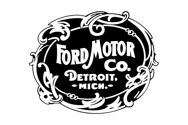
In July 1903, a Chicago dentist named Ernst Pfennig handed over the money for a Ford Model A and became the first person to buy a car from a company that was, at that point, about a month old and nearly out of cash. The machine he drove away in did not wear a blue oval. It did not wear a script signature either. What Ford Motor Company had in 1903 was a printed roundel — an ornate art-nouveau circle of the kind that decorated bicycle catalogues and patent-medicine tins — and it lasted barely four years.
What replaced it has lasted more than a century. The Ford script, drawn around 1907 and settled by 1909, is one of the oldest continuously used wordmarks in any industry, older than most national flags currently in use and roughly contemporary with the Boy Scouts. It has survived two world wars, the death of the Model T, the near-collapse of the American auto industry, and the migration of an entire brand identity onto glass screens measured in millimetres. Along the way it has been stretched, boxed, winged, ovalled, chromed, gradiented, and finally flattened.
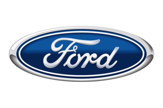
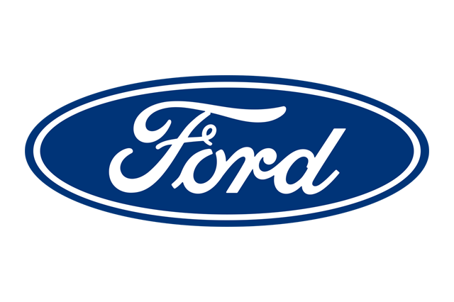
This is the full sequence, and more usefully, the reasons behind it. Almost every change to Ford's badge maps onto something concrete: a new factory, a new printing process, a new market, a new boss, or a new kind of screen.
1903: the roundel that looked like a bicycle catalogue
Ford Motor Company was incorporated on 16 June 1903 in a converted wagon works on Mack Avenue in Detroit, capitalised by twelve investors including the Dodge brothers, who were supplying the chassis and engines. Henry Ford was 39, on his third attempt at running a car company, and the two previous failures had left him with something valuable: a reputation, and no illusions about how quickly a name could vanish.
The first Ford emblem reflected exactly that anxiety. It said everything at once.
Inside a circular border sat a dense band of text — the company name, the word Detroit, the state — wrapped around a decorative field, all rendered in the whiplash curves and asymmetric borders of art nouveau. It was a seal rather than a logo, closer to a notary stamp than a badge. That was normal for 1903. Early automobile firms were selling reassurance to a public that reasonably suspected the whole industry of being a swindle, and a seal implied incorporation, permanence, an address you could visit.
It also reflected how the mark was actually reproduced. In 1903 a company's identity lived almost entirely on paper: letterheads, invoices, magazine advertisements, catalogue covers. All of those were printed by letterpress or engraving, processes that handle hairline detail beautifully at a fixed size. Nobody was worried about how the roundel would look stamped into a brass radiator surround, because in 1903 nobody put company logos on radiators. The car wore its name in plain letters, if it wore anything at all.
The problem with a seal is that it does not scale, does not simplify, and does not become familiar. Read the 1903 mark at a glance and you retain a circle. You do not retain "Ford."
1907: the script arrives
Sometime around 1907 — the exact commissioning is not documented in a way anyone can point to — Ford's identity was rebuilt around a single word in a flowing commercial script.
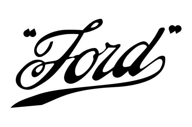
The change is total. Everything descriptive is gone. No Detroit, no Michigan, no incorporation language, no ornamental frame. Just the name, written as though someone had signed it. The capital F opens with a generous loop and trails a long stroke that sweeps beneath the following letters, tying the word together into one connected gesture; the terminal d answers it with a looped ascender leaning back over the word.
The visual language is Spencerian, or something close to it — the ornamental round hand taught in American business schools from the 1850s onward, the standard script of ledgers, promissory notes and correspondence for two generations. To an American in 1907, that letterform read as commerce: trustworthy, hand-executed, personal. Coca-Cola had reached for exactly the same associations in 1886, when bookkeeper Frank Mason Robinson wrote out the name in Spencerian and accidentally created the most valuable wordmark on earth.
Ford's version had one enormous practical advantage over the roundel. A single-weight connected script can be cut into a stencil, cast in brass, bent from wire, painted by hand on a delivery van door, or reduced to the width of a fingernail on a hub cap, and it stays recognisable. It is a shape, not a document.
The man with the printing set: Childe Harold Wills
The script is generally credited to Childe Harold Wills, and the credit is deserved, though the popular version of the story has drifted.
Wills, born in 1878 and named by his father after Byron's poem, was Henry Ford's first significant employee and for years his most important one. He was a draughtsman, a metallurgist and a designer, and his fingerprints are all over the Model T: he pushed the adoption of vanadium steel, the alloy that let Ford build a car that was simultaneously light and strong enough to survive American roads that were, in 1908, mostly not roads. He was also a genuine engineer of the practical type, reportedly working with Ford in an unheated back room during the earliest experiments, the two of them boxing to keep their hands warm.
The relevant detail is what Wills had done before cars. As a teenager he had done job printing, and he had kept an ornamental type or stencil set from that period — the sort of decorative script alphabets that small commercial printers used for wedding invitations and business cards. When the young company needed a name treatment, he had the tools and the eye to draw one.
By 1909 the script had settled into essentially the form used today, and Ford began deploying it with unusual discipline: on advertisements, on radiator plates, on dealership signage, on the wooden crates that Model T parts shipped in. That discipline mattered more than the drawing. Plenty of companies in 1909 had a nice wordmark. Very few used the same one, everywhere, for a hundred years.
Wills left Ford in 1919 during the purge that followed Henry Ford's buyout of the minority shareholders, took a large settlement, and built his own car — the Wills Sainte Claire, an advanced molybdenum-steel machine with an overhead-cam V8, made in Marysville, Michigan, and marketed under a flying-goose emblem. It was too expensive and too fussy, and the company folded in the late 1920s. Wills ended his career at Chrysler and died in 1940. His car is a footnote. His lettering is on roughly every third pickup truck in North America.
The signature myth, and what is actually true
The story most people have heard is that the Ford logo is Henry Ford's own signature. It is repeated in books, on museum placards, and in a great many articles.
The truth is more interesting and slightly less romantic. The script is not a reproduction of Henry Ford's handwriting. Ford's actual signature — which survives on cheques, letters and documents — is a different hand: more angular, less looped, recognisably the writing of a man who wrote quickly rather than decoratively. The logo is a designed script, drawn in a conventional period style by someone who knew ornamental lettering.
What is true is that it was meant to function as a signature. In 1907 the distinction between a proprietor's autograph and a house script was thin, and deliberately so. A signature-shaped mark implied that a specific person stood behind the product — which, at Ford, was emphatically the case. Henry Ford was not a distant chairman; he was the argument. The script borrowed the authority of a personal guarantee without literally being one.
There is a second, smaller myth worth clearing up: that the script has never changed. It has, subtly and repeatedly. Line weights have been evened out, the flourish beneath the word has been tightened and lengthened at different points, and the curve of the F loop has been redrawn for reproduction at small sizes. The 2017 script is not a scan of the 1909 script. It is a careful descendant that reads identically at a glance and differs measurably under a loupe — which is exactly what a well-managed wordmark should be.
1911: the oval, and why it came from England
The blue oval is so completely American in association that its shape almost certainly came from Britain.
The widely repeated account traces the oval frame to Ford's British agents in the years before the First World War, who used an oval sign or badge carrying the Ford script and the slogan "The Universal Car." Britain mattered enormously to Ford at this moment: 1911 is the year Ford Motor Company (England) was established and Model T assembly began at Trafford Park in Manchester — the first Ford assembly operation outside North America, and the seed of a European business that would eventually give the world Dagenham, the Cortina and the Fiesta.
The oval solved a specific problem that the bare script could not. A free-floating word needs a clean background; put it on a painted shopfront, a dusty enamel road sign or a magazine page dense with type, and it competes. An oval gives the script its own field, defines a fixed aspect ratio for sign-makers, and — critically — produces a shape that can be read from a distance before any letter is legible. Vitreous-enamel signage, then the dominant medium for roadside advertising, loved simple closed shapes with flat colour fills.
1912: the winged pyramid, and the shortest chapter in the story
Then, briefly, Ford lost its nerve.
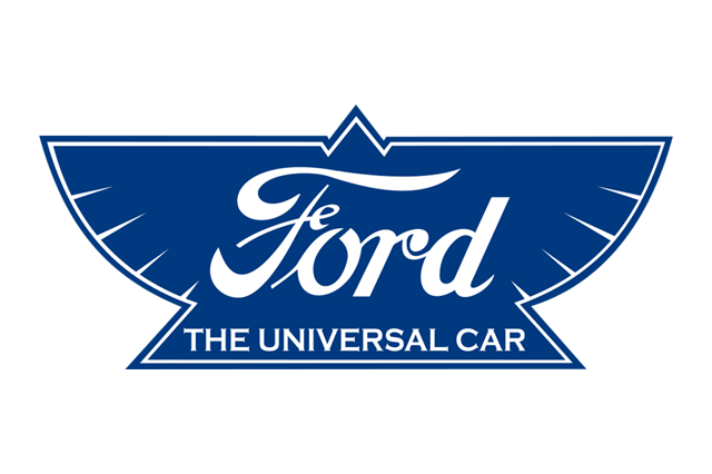
Around 1912 the company issued a mark built on a winged triangle or pyramid, rendered in orange and blue, with the script and the "Universal Car" line attached. Wings were epidemic in early automotive branding — they signified speed, modernity and the borrowed glamour of aviation, and half the industry used them at some point. A pyramid added connotations of solidity and permanence.
It did not last. The winged pyramid is the only real detour in Ford's badge history, and it survives mostly as a curiosity in collections of early Ford ephemera. The reasons for its retirement are not hard to guess. It said nothing the script did not already say, it added a second visual idea that had to be redrawn for every application, and it pointed the brand at aspiration at precisely the moment Ford's entire strategy was pointing at the opposite thing.
Because 1912 to 1913 is when Ford stopped being a car company and became an industrial phenomenon. The moving assembly line went into Highland Park in 1913. The Model T's price fell year after year. In January 1914 came the five-dollar day. A brand in the middle of that argument does not need wings. It needs to look like a bank.
1917: the script gets a permanent frame
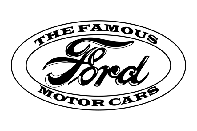
By the late 1910s the oval outline around the script had become standard in Ford's American advertising and on its dealer material.
This is the version that establishes the geometry Ford still uses: a horizontally stretched oval, a thin border, the script sitting inside with the flourish running nearly to the frame's edge. The proportions are already close to the modern badge. The colour is not — this was a line mark, printed in whatever ink the job called for, most often black.
It is worth pausing on how conservative Ford's approach had already become. Between 1909 and 1917, General Motors was assembling a portfolio of marques with unrelated crests, and Chevrolet had just adopted the bowtie in 1913 — a shape whose origins Chevrolet itself has never definitively settled, with competing accounts involving Parisian wallpaper, a Virginia newspaper advertisement for a coal product, and a sketch on a Hot Springs dinner table.
Ford, meanwhile, had one word and one shape and simply kept using them.
1927: the blue oval and the Model A
The badge everyone actually pictures arrives with the most traumatic product transition in the company's history.
Model T production ended in May 1927 after roughly fifteen million cars, by which point the design was nineteen years old and being comprehensively beaten by Chevrolet. Ford shut down for months to retool — an extraordinarily expensive gamble — and on 2 December 1927 launched the Model A, a genuinely modern car with a sliding-gear transmission, four-wheel brakes, and safety glass in the windscreen.
A new car needed a new face, and Ford filled the oval with deep blue and rendered the script in white. That is the entire change, and it is the whole ballgame. Colour turned a line drawing into an object — something that could be executed as vitreous enamel over stamped steel on a radiator shell, glowing against nickel plate, visible across a street.
The Model A was a sensation. Crowds reportedly numbered in the millions across its introduction week in American cities; police were needed for crowd control at some showrooms. Whatever the badge had been before, from 1927 it was attached to one of the most anticipated consumer products of the century.
Why blue?
There is no surviving decree explaining the colour choice, and anyone who tells you precisely why Ford chose blue is guessing. What can be said is that blue was doing specific work in 1927. It was the least fashionable colour available and therefore the most stable — red reads as sport, green as heritage, black as funereal, but blue reads as reliable, industrial, institutional. It also survives outdoors: blue vitreous enamel and blue paint hold up better under sunlight than red pigments of the period, which faded notoriously.
The particular blue was standardised much later, and is usually specified in the Pantone 294 family — a deep, slightly navy blue with no purple in it. Ford has adjusted the exact value across media and eras, but the perceptual identity has been remarkably stable for nearly a century.
1957: the oval gets a haircut
For roughly three decades the oval was mostly a corporate mark rather than a product badge. Ford cars of the 1930s, 40s and 50s wore block lettering, crests, shields and hood ornaments; the oval lived on dealership signs, in advertisements, on parts packaging and on the sides of trucks.
The 1957 redrawing tightened it. The oval became wider and shallower, the border thinner, the script cleaner and better fitted to the frame. This was Ford at the height of its jet-age confidence: 1957 brought the sharply finned Fairlane, the Skyliner retractable hardtop with its extraordinary folding steel roof, the second-generation Thunderbird, and — that September — the launch of the Edsel division, which would become the most studied branding failure in American business history.
The design logic of the wider oval is straightforward. Everything in 1957 was longer and lower: cars, house plans, television screens, typography. A near-circular badge looks vertical and old-fashioned next to a car with a 118-inch wheelbase and tailfins. Stretching the oval was the badge equivalent of lowering the roofline.
1976: the oval becomes corporate law
The single most consequential decision in Ford's badge history was not a drawing. It was a mandate.
In 1976 Ford formalised the blue oval as its global corporate identity — one mark, one specification, applied consistently across vehicles, dealerships, advertising, packaging, stationery and factory signage worldwide. Before this, Ford's visual identity was a family resemblance. After it, it was a system.
Three forces pushed this. First, globalisation: by the mid-1970s Ford was running genuinely international operations, and Ford of Europe, formed in 1967, had begun engineering cars like the Fiesta for multiple markets at once. A single mark was cheaper and clearer than a dozen regional interpretations. Second, the corporate identity movement: the 1960s and 70s were the great age of the design manual, when firms across every industry hired consultancies to codify logos into rulebooks of clear space, minimum sizes and approved colour breakdowns. Third, the oil crisis. After 1973, Detroit was fighting a credibility war against imports, and a company that looks unified looks competent.
From the late 1970s the oval also began migrating decisively back onto the cars themselves — onto grilles, tailgates and boot lids — displacing the block letters and crests that had carried Ford's identity through the postwar decades.
2003: the Centennial oval and the age of gradients
Ford turned 100 on 16 June 2003, and the badge was dressed for the party.
The Centennial mark kept the shape and script and added dimension: a graduated blue field lighter at the top, a bright specular highlight running across the upper curve, a chromed bevel around the rim, and a soft drop shadow. On paper and on a good screen it looked like a physical object photographed under studio lighting — which was precisely the intent, because by 2003 the plastic badge on the car actually did have a chrome bevel and a gloss coat, and the graphic was catching up to the hardware.
It was also completely of its moment. The early 2000s were the peak of skeuomorphic branding: gel buttons, glassy reflections, bevelled everything, an aesthetic that ran from software interfaces to fizzy-drink cans. Compare what other manufacturers were doing in the same window — chrome-ringed three-dimensional roundels and gradient-filled crests were everywhere.
The trouble with a gradient logo is that it is not one logo. It is a photograph of a logo, and it needs resolution, colour depth and a light background to survive. Reproduce it as a single-colour embroidery on a polo shirt, an engraving on a key, a fax, a 16-pixel favicon, or a white-on-dark screen at night, and it either falls apart or requires a separate specially drawn version. By the early 2010s most brands were maintaining half a dozen exceptions to their own logo.
2017: flat, and why the screen won
From around 2017 Ford began rolling out a flat oval: one solid blue, one white script, a clean edge, no gradient, no bevel, no shadow. It arrived quietly, appearing first in digital contexts and spreading outward, which is itself the story — the badge was redesigned for the place it now spends most of its life.
By the late 2010s the majority of a car brand's logo impressions were happening on screens: search results, app icons, in-car infotainment, configurator tools, social avatars, connected-car notifications on a phone lock screen. Those contexts have a specific set of demands, and a gradient fails all of them.
- Small sizes. A favicon or app icon is often rendered at 16 to 32 pixels. A bevel at that size is mud.
- Vector rendering. Flat shapes ship as tiny SVG files that stay razor-sharp on any display density; a gradient with a photographic highlight does not.
- Dark mode. A logo with baked-in top lighting and a drop shadow assumes a white page. Interfaces stopped assuming that around 2018.
- Animation. A flat shape can be morphed, drawn on, or animated cheaply. A rendered object cannot.
- Single-colour reproduction. Embroidery, engraving, embossing, and monochrome print all want one silhouette.
Ford was in good company. Volkswagen launched its flattened, two-dimensional "New Volkswagen" mark in 2019, explicitly framing it as a logo built for digital and for a brand pivoting to electric cars.

BMW released a flat, transparent-centred version of its roundel for communications in 2020. Toyota flattened its three ellipses around 2019 and, in Europe, began dropping the wordmark entirely. Cadillac spent two decades subtracting — the small birds known as merlettes left the crest in 2002, the laurel wreath was dropped around 2014, and by the 2021 launch of the Lyriq the crest had been stretched wide and rendered monochrome.
The direction of travel is identical everywhere, and it is worth laying out.
| Brand | Mark first established | Most recent major redesign | Direction |
|---|---|---|---|
| Ford | Script c.1907–09; oval c.1911; blue oval 1927 | Flat oval, c.2017 | Subtract dimension, keep everything else |
| Chevrolet | Bowtie, 1913 | Gold-and-chrome standardisation from 2004, flat variants since | Simplify, keep the silhouette |
| Cadillac | Crest, 1900s | Widened monochrome crest, c.2021 | Continuous subtraction |
| Lincoln | Four-pointed star, mid-20th century | Star emphasised over wordmark, 2010s onward | Refresh, never replace |
| Toyota | Three ellipses, 1989 | Flattened, c.2019 | Flatten, drop wordmark in some markets |
| Volkswagen | Roundel, 1930s | Flat "New Volkswagen", 2019 | Flatten explicitly for screens |
| BMW | Roundel, 1917 | Flat transparent version, 2020 | Flatten for communications only |
Ford's row is the shortest because Ford has had the least to undo. There is no crest to strip, no heraldry to explain, no wordmark that stopped matching the company. The script and the oval have been doing the same job since before most of these brands existed.
What the badge is actually made of now
The modern blue oval is a piece of engineering, and it has quietly become one of the more constrained components on the front of a car.
A 1927 badge was vitreous enamel fused onto a stamped metal base — glass powder fired at high temperature, giving a hard, glossy, UV-stable surface. By the 1980s badges were injection-moulded plastic with a vacuum-metallised bright ring and a coloured, clear-coated field: cheaper, lighter, and easier to curve to a grille surface.
Then Ford put a radar behind it. Adaptive cruise control and forward collision systems need a millimetre-wave radar aimed straight down the road, and the natural place to mount it is dead centre in the grille — directly behind the badge. Metal reflects radar. So the modern grille badge on a car equipped with those systems is not metal-plated at all: it is a radome, a multilayer moulding using specially engineered decorative films and indium or similar discontinuous coatings that look like chrome to the eye but let radar pass through. The badge also has to survive stone chips, ice, car-wash brushes, and the heating element some designs include to melt snow off the radar aperture.
At the back it is doing another job. On Ford trucks the reversing camera has for years been packaged in or immediately beside the tailgate emblem, which means the badge is simultaneously a brand mark, a sensor housing and a serviceable part with a wiring harness attached.
The Mustang exception
Ford has one significant, permanent exception to its own badge rule, and it is the most emotionally important product in the portfolio.
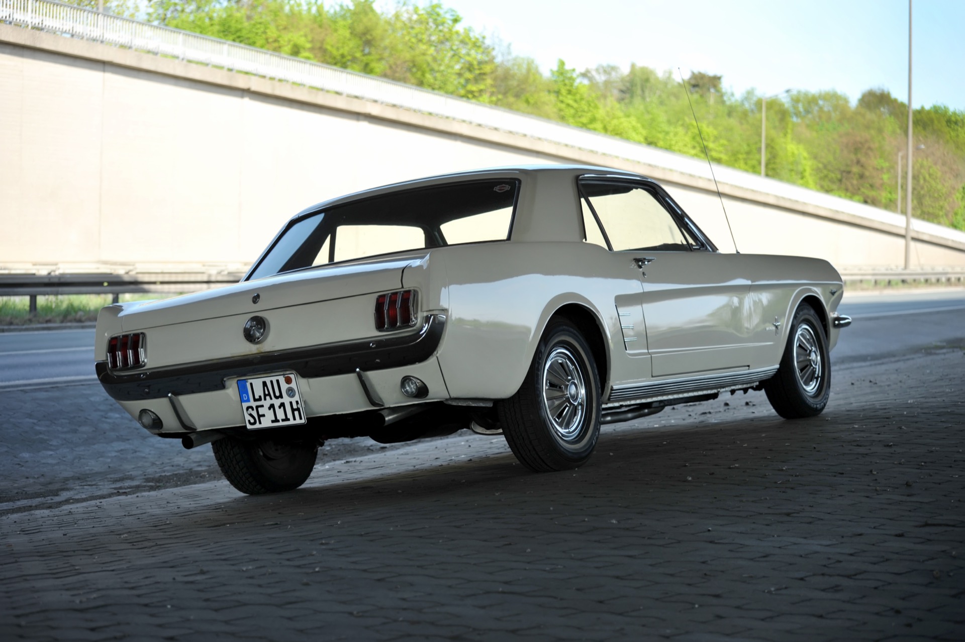
The Mustang, introduced on 17 April 1964 at the New York World's Fair, wears a running horse, not a blue oval, in its grille. The pony emblem, developed during the car's design programme with the young Ford designer Phil Clark closely associated with its creation, faces left, gallops, and has been the car's face for six decades. The blue oval appears on a Mustang — usually on the boot lid or as a small mark elsewhere — but never as the primary identity at the front.
That exception has since been extended in a way that tells you a great deal about how Ford now values its marks. When Ford launched its first serious electric vehicle in 2020, it did not badge it as a Ford. It badged it as a Mustang — the Mach-E carries the pony, not the oval. That was a controversial decision among enthusiasts and a coldly rational one commercially: Ford calculated that the equity in the horse was more useful for selling an unfamiliar product than the equity in the corporate badge.
Ford's other divisions have long operated the same way. Lincoln has never worn the oval; its four-pointed star has run in parallel since Ford bought the company from Henry Leland in 1922, and Lincoln has spent the last decade making the star bigger and the word "Lincoln" smaller.
The F-Series: the badge as a billboard
If the Mustang is where Ford's badge steps back, the F-Series is where it takes over the entire front of the vehicle.
The F-Series began in 1948 with the "Bonus Built" F-1 through F-8 range, and for decades those trucks wore FORD in block capitals across the hood or grille — a treatment that is still periodically revived, most conspicuously on Raptor and heritage-styled trims where big spaced-out letters replace the oval entirely.
But the mainstream F-150 took the opposite path. Through the 1990s and 2000s the oval on the grille grew steadily larger, until on some generations it is one of the biggest single brand marks fitted to any mass-market vehicle. There is a reason for that beyond ego. The F-Series has been America's best-selling pickup since 1977 and its best-selling vehicle overall since the early 1980s, and truck buyers are the most brand-loyal customers in the industry. A grille badge the size of a dinner plate is not decoration; it is a statement of allegiance aimed at everyone in the neighbouring lane.
It also works because the oval is a shape that survives scaling in both directions. Enlarge a crest and you expose every awkward detail. Enlarge an oval with a script inside it and you just get a bigger oval.
The time Ford mortgaged the blue oval
In November 2006, facing a catastrophic cash position and about to launch the restructuring plan that would define Alan Mulally's tenure, Ford borrowed roughly $23.5 billion by pledging essentially everything it owned as collateral: factories, equipment, stock in subsidiaries — and its trademarks, including the blue oval itself.
It was a startling thing for a company to do, and Ford's executives said so openly. The wager was that borrowing against the entire company before the credit markets froze was better than being caught without cash later. It turned out to be one of the best-timed decisions in modern corporate finance: when the 2008 crisis hit, General Motors and Chrysler went through bankruptcy and government rescue, and Ford, uniquely among the Detroit three, did not.
The oval came home in May 2012, when Moody's restored Ford's credit to investment grade and the collateral securing the loans was released. Ford's own people described it in exactly those terms — getting the Blue Oval back. It is the only case in automotive history where a logo was, in a literal legal sense, hocked and redeemed, and it is the clearest possible evidence that a badge is a balance-sheet asset and not just a graphic.
Where the oval goes in the electric era
The badge now faces a problem it has never had before: the front of an electric car has no radiator to put it on.
For 120 years the natural home of a car brand's mark was the grille, because the grille was a functional necessity and a fixed, flat, forward-facing panel. Electric vehicles need far less cooling airflow, and designers have replaced grilles with smooth closed noses, light bars and body-colour panels. Every manufacturer is now solving the same puzzle in one of three ways: shrink the badge and move it, integrate it into a lighting element, or make the whole nose the brand signature.
Ford is doing all three. The F-150 Lightning, revealed in May 2021 as an electric version of the most important vehicle the company builds, wears a full-width illuminated light bar across the nose, with the oval sitting in the middle of it — and on higher trims the badge itself is lit, turning a stamped shape into an emitted one for the first time in its history. The Mach-E, as noted, sidesteps the question entirely by wearing the pony.
An illuminated badge is a genuinely new design object. It has to look right when off — a grey-white lens in daylight is not the same thing as a blue enamel oval — and it has to meet lighting regulations that differ by market, since not every jurisdiction allows illuminated non-lighting elements at the front of a vehicle. The flat 2017 logo turns out to be well-suited to it: a single flat colour field with a clean silhouette is exactly what you want to backlight evenly.
There is also a deeper strategic reason the oval matters more now, not less. In 2022 Ford split its operations into Ford Blue for combustion vehicles, Ford Model e for electric ones, and Ford Pro for commercial customers. Three businesses with three cultures and three cost structures — and one badge holding them together. The oval is now doing organisational work as much as visual work.
What to look for next time you see one
The next Ford you walk past, look at three things.
Look at the flourish. Find where the tail of the F runs beneath the word and see how close it comes to the oval's border, and how it terminates. That single stroke is the most redrawn part of the mark, and comparing it across a 1950s enamel dealer sign, a 1990s tailgate and a current app icon is the quickest way to see how much quiet revision has gone into something everyone assumes has never changed.
Look at the surface. Is the rim actually chromed, or is it a film? Tap it — a radar-transparent badge on a car with adaptive cruise sounds and feels different from a plated one, and its bright ring often has a very slightly warmer, less mirror-like quality than real metal.
Look at where it isn't. Note which Fords wear the oval at the front and which wear something else — a pony, block letters, a Lincoln star — and you are reading a map of where the company thinks its value actually lives. That map has changed more in the last five years than the logo has in the last fifty.
Childe Harold Wills drew a word with a printer's stencil set in a cold Detroit workshop, and it is still on the road. Very little else from 1907 is.


