
Stand at the end of a supermarket car park and squint. At forty metres you cannot read a single word on any of those grilles, but you can still name half the cars. What survives the distance is not the lettering, not the colour, not the fine detail of a prancing horse or a winged crest. What survives is the outline: a circle, an oval, a shield, a diamond, a pair of wings. There are perhaps six of them in common use, and the entire global car industry has spent 120 years rearranging the contents inside those six containers.
That is not an accident of taste. It is the product of a very specific set of pressures — heraldic borrowing, chrome-casting economics, the width of a radiator aperture, the legibility of a mark at 100 km/h and at 32 pixels square — that quietly pushed hundreds of independent design decisions towards the same handful of silhouettes. Understanding the geometry tells you more about a brand than the symbol inside it.
Why badges converge on so few outlines
A car badge is not a logo in the ordinary graphic-design sense. It is a physical object that has to be manufactured, mounted, sealed against water, survive a decade of car washes and UV, and then work again as flat artwork on a brochure, a steering wheel boss, a wheel centre cap and an app icon.
Every one of those jobs punishes complexity in the same direction. A closed, convex outline is easier to tool, easier to seal, easier to centre on a grille, easier to crop into a square, and easier to recognise when it is small or moving. Concave outlines with thin protrusions — the spiky, ornate marks that were common before the Second World War — chip, trap dirt, and disappear at distance.
So the survivors converge. What remains is a taxonomy of enclosures, each carrying a different inherited meaning.
| Shape family | Reads as | Typical era of adoption | Grille behaviour |
|---|---|---|---|
| Circle | Wheel, globe, completeness, engineering | 1900s–1930s, revived 1990s | Centres easily, works as a hub cap |
| Oval | Approachability, breadth, mass market | 1900s–1990s | Matches a wide, low aperture |
| Shield / crest | Authority, place, lineage | 1900s–1960s | Suits tall, vertical grilles |
| Triangle / diamond | Precision, engineering, modernity | 1920s–1970s | Strong at small sizes |
| Wings | Speed, flight, aspiration | 1910s–1930s, revived 2000s | Needs horizontal width |
| Free-standing wordmark | Software, transparency, newness | 2010s onwards | Needs a blank surface, not a grille |
The circle: wheels, globes and the promise of completeness
The circle is the default. It is the shape of the wheel, the piston, the steering wheel, the globe, the dial of a gauge — every rotational object a car company could plausibly want to invoke. It is also the only outline with no orientation, which is a genuine manufacturing convenience: a circular escutcheon can be pressed, spun or moulded without worrying about which way up it sits in the tool.
BMW's roundel is the archetype, and its origin is more prosaic than the legend suggests. When Rapp Motorenwerke became Bayerische Motoren Werke in 1917, the new company kept the shape of Rapp's circular mark and swapped the contents for a quartered blue-and-white field. Those are the colours of the Free State of Bavaria — reversed in sequence, because trademark law of the period did not permit the direct commercial use of state arms.
The spinning-propeller reading came later, popularised by BMW's own advertising around 1929, when the firm's aero-engine business was worth advertising. It is a retrofitted story, but a good one, and it stuck so firmly that most owners now believe it is the origin. The lesson for anyone studying badges: the meaning attached to a shape is frequently invented after the shape is chosen.
The circle as a frame for something else
Many circular badges are not really circles. They are rings drawn around a mark that could not stand alone.
The Mercedes-Benz three-pointed star was registered by Daimler in 1909, said to represent motorisation on land, on water and in the air — the ambition of a firm that sold engines for all three. The star on its own is a fragile object: three thin spokes with enormous negative space between them. The ring, which arrived with the 1926 merger that folded in Benz's laurel wreath, does the structural work. It gives the star an edge to attach to, a rim to chrome, and a silhouette that survives being shrunk.

Volkswagen's roundel works the same way. The V-over-W monogram is a clever piece of lettering but a weak silhouette; the enclosing circle turns it into an object. The mark was fixed in its recognisable form around the founding of the Wolfsburg plant in the late 1930s, survived British Army administration after 1945, and has been redrawn perhaps a dozen times since — always as a circle.
The 2019 redesign is the most instructive of those revisions. Volkswagen stripped the badge of its chrome bevel, its drop shadow and its blue fill, leaving a thin-line ring and monogram. The reason given was digital: a two-dimensional outline reads cleanly on a phone screen, animates easily, and works in a single ink. The circle stayed. Everything inside and around it was negotiable.
Circles that carry a place
Alfa Romeo's badge is the most crowded circle in the industry and the least willing to give anything up. It contains the red cross of the city of Milan and the biscione, the crowned serpent of the Visconti dynasty, side by side — two municipal emblems that predate the car by several centuries. A.L.F.A. adopted it in 1910; Nicola Romeo's name joined after 1918.
For most of its life the badge had a vertical dividing line and a written ring around the outside. The 2015 revision removed the dividing bar and simplified the wreath, which sounds trivial and was not: a bisected circle reads as two half-moons at small sizes, while an undivided one holds together as a single disc.
Skoda's winged arrow, inherited from the Laurin & Klement era and formalised in the 1920s, is a rare case where the contents are more directional than the frame. The arrow points right; the circle contains it. Remove the ring and the arrow becomes an aggressive slash. Keep the ring and it becomes a compass.
Volvo's iron mark is the circle-with-arrow used since antiquity for iron and for Mars, chosen to invoke Swedish steel and Swedish engineering rather than anything martial. It also produced one of the best pieces of accidental industrial design in the business: the diagonal band across early Volvo grilles began life as the bracket that physically held the badge in place. A fixing became a signature, and Volvo has kept the diagonal long after the engineering need for it disappeared.

Nissan's roundel descends from the Datsun sun-disc marks of the 1930s — a red circle with a horizontal bar carrying the name, an unmistakable evocation of the rising sun. The bar-through-circle arrangement solved a real problem: it gave a wordmark a home inside a shape that otherwise has no natural place to put text.
Circles that are also hub caps
There is a practical reason circular badges persist that has nothing to do with symbolism. A wheel centre cap is a circle. So is a steering wheel boss, and so is the crown of most gear knobs. A brand with a circular mark gets those surfaces for free; a brand with a wide oval or a horizontal wordmark has to redraw its identity for each of them, or leave the surface blank.
Mini is the interesting hybrid here. The badge is a circle with wings, which means it works in two modes: the full winged version on the bonnet and boot, and the naked disc on the wheel centres. That flexibility is worth a great deal, and it explains why so many winged marks are built around a circular or oval core rather than being pure wings.
The oval: the friendlier, wider cousin
An oval is a circle that has been asked to accommodate a word. Stretch a disc horizontally and you get room for lettering at a legible size, plus a silhouette that matches the aperture of a radiator grille — which is almost always wider than it is tall.

Ford has used an oval since 1907, when the script name was first set inside one, and the blue-on-white version has been the constant since it appeared on the Model A in 1927. The proportions have shifted repeatedly — fatter in the 1970s, slimmer and more three-dimensional in 2003, flattened again in 2017 — but the outline has not changed in nearly a century.
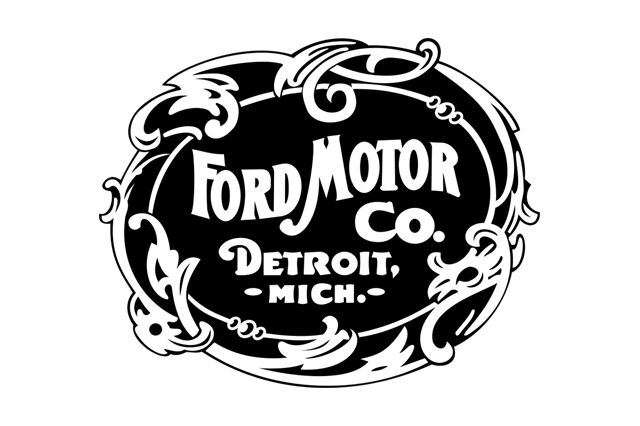
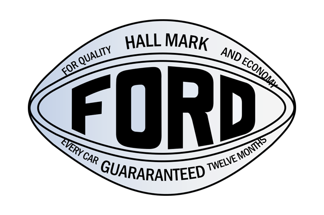
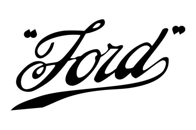
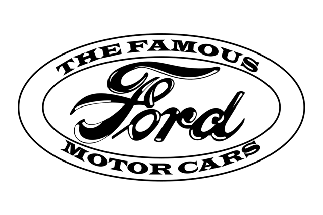
That longevity is the point. Ford's oval is arguably the single most-tested piece of geometry in the industry: it has survived on radiators, on grilles, on tailgates, on trucks the size of small buildings, and it still crops cleanly into a square avatar. The reason is proportion. The Ford oval is not very elongated — closer to 5:3 than to 3:1 — which means it retains most of the circle's compactness while gaining just enough width for a five-letter script.
The Japanese ovals
Toyota's badge is the most rigorously geometric mark on this list. Adopted in 1989 for the company's fiftieth anniversary, it is three overlapping ellipses: two perpendicular inner ellipses forming a stylised T, enclosed by a third. The intersections are said to represent the relationship between customer and company, with the surrounding oval standing for the wider world.

What makes it work is that every curve is derived from the same construction. Shrink it and the parts do not fight each other, because they are the same shape at different scales. Toyota's 2019 flattening simply removed the chrome gradients and let the geometry do the work.
Mazda has changed its mark more often than almost any mainstream brand, but has returned to the oval again and again. The current version, introduced in 1997, sets a pair of stylised wings — usually described as suggesting flight and forward motion — inside an oval. Earlier attempts placed a diamond, a rounded M and various winged devices in similar frames.

Subaru's oval is the only badge here that is literally a star map. Subaru is the Japanese name for the Pleiades cluster, and the badge shows six stars — one large, five smaller — corresponding both to the cluster and to the group of companies that merged to form Fuji Heavy Industries in the early 1950s. Setting them in an oval rather than a circle gives the constellation somewhere to spread out.
Hyundai's slanted H inside an oval, in use since around 1990, is usually explained as two figures shaking hands — a company and a customer. The italic slant is doing something more practical: it prevents the H from reading as a plain letter and gives an otherwise static oval a direction of travel.
Bugatti's red oval macaron is the aristocrat of the family. Its border is studded with a ring of small dots, commonly read as pearls, in keeping with Ettore Bugatti's habit of treating his cars as jewellery. On the modern cars it is a genuinely expensive component — enamel and precious metal on the limited-run models — which is a reminder that a badge is a physical object with a bill of materials, not merely a drawing.
Shields and crests: borrowed authority
Circles and ovals are neutral. Shields are not. A shield is a direct quotation from heraldry, and it says the same thing every time: we come from somewhere, and that somewhere vouches for us.
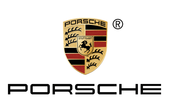
The Porsche crest, finalised in the early 1950s, is a compound of two coats of arms. The rearing horse in the centre is the arms of Stuttgart, the city built on a stud farm — Stuotgarten — where Porsche is based. The antlers and the red-and-black stripes around it come from the arms of the former state of Württemberg. There is no invented symbolism at all: it is a civic address rendered in enamel.
The shape is doing something specific. A shield is wider at the top and tapers to a point, which makes it read as vertical even when it is small — and vertical is exactly what you want on a bonnet, where the badge sits on a surface that recedes from the viewer. A circle on a sloping bonnet foreshortens into an ellipse. A shield foreshortens into a slightly shorter shield, and nobody notices.
Cadillac's crest is the American equivalent, and it has had a harder life. It derives from the arms attributed to Antoine de la Mothe Cadillac, the French officer who founded Detroit in 1701. For most of the twentieth century it was an intricate quartered shield with a coronet above it and a flock of small heraldic birds — merlettes — scattered across the quarters.
Those birds are a case study in the tyranny of small sizes. They were removed around the turn of the millennium because they had become an indistinct smudge at any realistic viewing distance. The encircling laurel wreath followed in 2014, and the shield was stretched wider and flatter. By 2021, on the electric models, the whole thing had gone monochrome.
Shields with animals in them
Ferrari runs two marks in parallel, and the difference between them is purely geometric. The road cars carry the prancing horse on a rectangular field; the racing cars carry the Scuderia shield, which adds the letters S and F and a band of the Italian tricolour along the top. The horse itself was the emblem of the First World War flying ace Francesco Baracca, given to Enzo Ferrari by the pilot's family; the canary yellow behind it is the colour of Modena, Enzo's home city.
Abarth's scorpion is a personal joke that hardened into an institution: Carlo Abarth was born in mid-November, under the sign of Scorpio. The shield carries the tricolour band across the top, exactly as Ferrari's does, and for the same reason — a horizontal bar of colour gives an otherwise dark, busy shield a strong horizontal anchor at the point where the eye enters it.
Peugeot's lion is the oldest continuously used animal in the business, and it did not begin on a car. It was registered in 1858 as a trademark for saw blades, chosen because a lion's teeth advertised the qualities Peugeot wanted associated with steel: sharpness, durability, flexibility. The lion has been a full body, a walking body, an outline, a hollow shape, and — since 2021 — a head enclosed in a shield.
That 2021 return to a shield is worth pausing on. Peugeot spent the 2000s and 2010s with a free-standing three-dimensional lion, then deliberately put a frame back around it. The stated logic was digital: a contained mark holds its own in a small square, whereas a free-standing figure floats and shrinks.
Lancia's badge is a shield inside a circle — a flag, a lance and a steering wheel on a blue field, ringed by the name. When the brand relaunched in the 2020s it went back to a version closely modelled on the 1957 circular badge rather than any of the flatter, squarer marks it had used in between. The message a shield sends is inseparable from heritage, which makes it an obvious tool for a revival.
Buick's tri-shield is the outlier: three shields rather than one, derived from the Scottish arms of the Buick family, arranged diagonally inside a circle from 1959 onwards. In 2022 Buick pulled the three shields out of the ring and set them side by side in a horizontal row. That single change tells you what modern badge design values — width, flatness, and no enclosure — more clearly than any manifesto.
Triangles and diamonds: the geometry of precision
Angular badges are rarer, and they say something different. A circle is organic and a shield is historical; a triangle or a rhombus is engineered. It has vertices, it has a construction, and it implies that somebody drew it with instruments.

Mitsubishi's three diamonds are the oldest corporate mark in this article and are not really diamonds at all. The name combines mitsu (three) and hishi (water chestnut, used to mean a rhombus), and the mark was created in the 1870s by Yataro Iwasaki by combining his own family's three-stacked-rhombus crest with the three-oak-leaf crest of the Tosa clan he had worked for.
The result has an unusual property: it is rotationally symmetrical at 120 degrees, so it cannot be mounted upside down. It also has no interior detail whatsoever, which is why it survives being reproduced in embroidery, in a single colour, at any size, on anything from a ship's funnel to a bank branch.

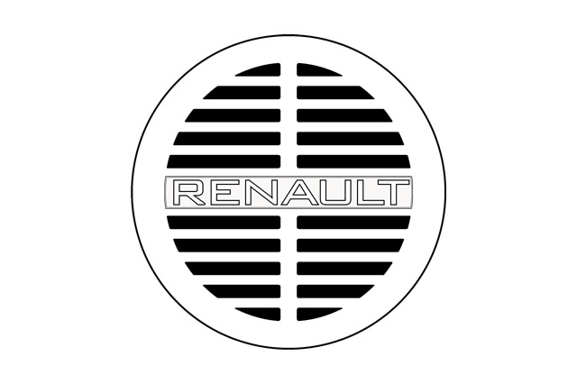
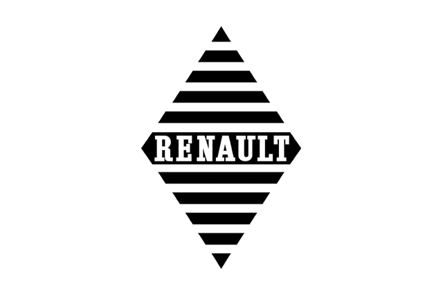
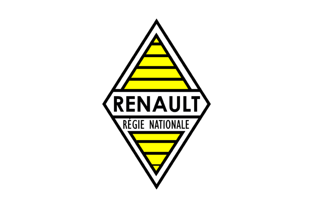
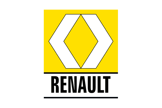
Renault's losange — the diamond — has been the company's mark since the mid-1920s, and its most interesting feature is functional. Renault's earlier badges were circular grilles for the horn, and when the diamond replaced them it kept the same job: the mark was a slotted plate through which the horn sounded. A logo that was also an acoustic aperture is about as literal an example of form following function as the industry offers.



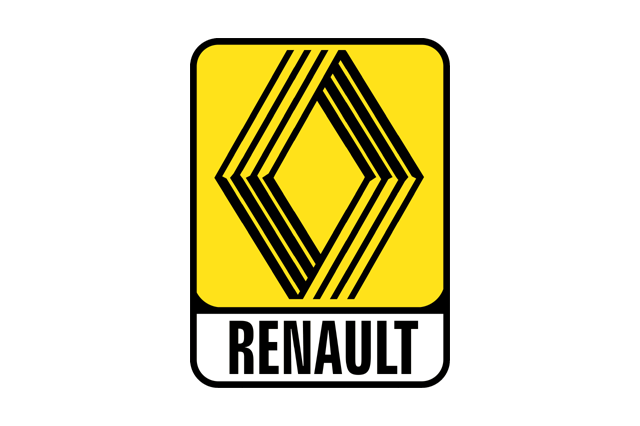
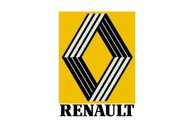
In 1972 Renault commissioned the op-art painter Victor Vasarely, working with his son, to redraw the diamond. The result — a lattice of parallel lines that produced an impossible, Escher-like ribbon — is one of the very few car badges designed by a major fine artist, and it defined the brand for a decade.
The 2021 version returns to that idea, rendering the diamond as a single interlocking ribbon in flat line art. It is a fifty-year-old solution reissued because the constraint came back: a line-art mark works in a browser tab, and a chrome-effect one does not.
Chrysler's Pentastar deserves a mention alongside these. Introduced in 1962 and used until the 1990s, it was a pentagon inside a pentagon — five-fold symmetry, no words, no illustration, entirely abstract. It was corporate rather than automotive, which is precisely why it was eventually replaced by something with wings.
Wings: aviation ambition, borrowed and kept
Wings are the most emotionally loaded shape in the taxonomy and the most structurally awkward. They are wide, they are horizontally symmetrical, and they end in feathered tips that are hell to cast and worse to shrink.
They persist because of what they meant when they were adopted. In the 1910s and 1920s, aviation was the most glamorous technology on earth, and a car company that put wings on its radiator was making a claim about speed and modernity that everyone understood immediately.
Bentley's winged B was drawn in 1919 by F. Gordon Crosby, the motoring artist, and it has been redrawn many times without ever changing its basic anatomy: a circular or oval centre carrying the letter, with a spread wing on each side. Bentley has long maintained that the number of feathers differs between the two wings across different versions of the badge, which — whatever its origin — functions as a quiet authentication device.
Aston Martin adopted wings in the 1920s and has kept them ever since, cycling through versions with the name on a central bar, versions with different feather counts, and versions with a coloured field behind. The 2021 revision simplified the feathering considerably and reduced the number of distinct elements, for the same reasons everyone else did.
MV Agusta's connection to flight is not metaphorical. The Agusta company was founded as an aircraft manufacturer in the early 1920s, and motorcycles were the post-war diversification, built at Verghera — the V in MV. Its badge is a circular shield set against a spread of wings, the same architecture as Bentley's, arrived at independently and for a much more literal reason.
Genesis, launched as a standalone Hyundai brand in the mid-2010s, chose wings from a standing start — an interesting decision, since the brand had no aviation history to invoke. What it wanted was the signal wings carry: this is a luxury car, from a tradition of luxury cars. The shape is a shortcut to a lineage the brand did not yet have.
Chrysler's return to wings in 1998, after four decades of the abstract Pentastar, was a similar move: an American brand reaching backwards past its own modernist period to the pre-war radiator-badge era. Wings are, in effect, a claim about the past made in the present tense.
The constraints nobody sees: casting, plating and radar
Everything above concerns meaning. What actually kills badge designs is manufacturing.
A traditional chrome grille badge is an injection-moulded plastic substrate, usually ABS, that is chemically etched, then electroplated with successive layers of copper, nickel and chromium. That process imposes hard rules. Sharp internal corners trap plating solution and produce dull spots. Thin, isolated islands of material do not plate evenly. Deep, narrow recesses shadow out. Every surface needs a draft angle so the part can leave the tool.
The result is a strong preference for smooth convex outlines, generous corner radii, and detail rendered as raised relief rather than fine incision. It is not a coincidence that the fussy, spiky, enamel-and-cloisonné badges of the 1930s gave way to smooth chromed shapes in the 1950s and 1960s; the manufacturing method changed underneath them.
The radar problem
The modern complication is that the badge is now standing in front of the car's forward-looking radar. On most vehicles with adaptive cruise control and automatic emergency braking, the sensor sits in the centre of the grille or bumper — exactly where the badge has always gone.
Metal blocks radar. So the plated-chrome badge, in its traditional form, is incompatible with the sensor behind it. The industry's solutions have been ingenious and expensive: physical vapour deposition of indium or tin in a discontinuous film that looks like chrome but does not conduct; multi-shot mouldings with metallised layers laser-ablated into isolated islands too small to reflect; painted-and-clear-coated substrates that mimic the depth of plating optically.
Those badges are also frequently heated, because a millimetre of ice or wet snow on the cover degrades the radar return. A modern emblem can therefore be a moulded, vacuum-metallised, laser-structured, electrically heated optical window — with a resistive element and a connector — that also happens to be the company's logo.
This is the strongest argument yet for simple geometry. Every additional feature in the badge outline is another discontinuity in the radome, another tooling step, another opportunity for a dielectric artefact in the sensor's field of view. Flat, clean, convex shapes are not just fashionable; they are cheaper to make radar-transparent.
Pedestrian protection and the death of the hood ornament
The other great constraint came from safety regulation. European pedestrian-protection requirements introduced in the mid-2000s effectively ended the rigid, upright bonnet ornament on mass-market cars. The standing figures that survive — the Spirit of Ecstasy, the Mercedes star on saloons that still use one — do so on retracting or breakaway mounts.
The consequence for badge geometry was immediate. An identity that had been carried by a three-dimensional sculpture standing proud of the bodywork had to migrate onto the flat face of the grille. That migration pushed brands towards enclosed two-dimensional marks with a defined outline, because a flat mark on a flat grille needs an edge to define it. The badge became a disc, not a statue.
Legibility at 100 km/h and at 32 pixels
There are two viewing conditions every badge must survive, and they are more similar than they look.
The first is the mirror test. A badge on the car behind you is seen small, briefly, off-axis, often in poor light, and frequently in motion. Under those conditions the eye resolves outline and gross contrast long before it resolves internal detail. That is why the Mitsubishi diamonds and the Mercedes star are identifiable at distances where a Cadillac merlette or an Alfa Romeo serpent is a grey smear.
The second is the icon test. The same mark has to work as a favicon, an app icon, a map pin, a dealer-locator marker and a 40-pixel avatar in a chat thread. The rendering constraints are nearly identical: outline survives, interior detail does not.
This convergence explains the flattening wave that swept the industry between roughly 2018 and 2022. Volkswagen in 2019, BMW in 2020 with its transparent-centre roundel, Nissan in 2020, Kia, Peugeot and Renault in 2021, Volvo in 2021, General Motors' lowercase corporate mark in 2021 — all removed gradients, bevels, drop shadows and simulated chrome in favour of flat line art.
It is easy to dismiss that as fashion, and there was certainly a herd element to it. But the underlying driver was real: brands were suddenly spending more of their identity budget on screens than on sheet metal, and a simulated-chrome badge that looked magnificent on a bonnet looked like a muddy grey blob at icon size. What all of those redesigns kept was the outline. What they threw away was everything that only existed to imitate a physical object.
The electric reset: brands that dropped the enclosure
The newest development runs against the whole history above: a number of electric brands have abandoned the enclosing shape altogether.

Tesla's mark is a free-standing stylised T, often explained as a cross-section of an electric motor's rotor pole. There is no ring, no shield, no oval. It sits on a blank nose where a grille used to be, and the absence of a frame is part of the message.
Rivian, Lucid and Polestar all follow the same logic in different ways: a geometric device or a bare wordmark, set on an unbroken surface, with no border to contain it. The design rationale is consistent. An enclosing shape is a picture frame, and a picture frame implies something historical hanging inside it. Brands whose pitch is that they are software companies that happen to build cars do not want the historical implication.
There is also a hard physical reason. An enclosed badge needs a bezel, and a bezel needs a surface to be set into. Electric cars have deleted the radiator grille, which is the surface that badges have been mounted on since the beginning. Without an aperture to sit in the middle of, a mark has nothing to be concentric with — so it stops trying, and becomes a wordmark placed across the nose or the tailgate instead.
Note who has not followed. Genesis kept its wings. Cadillac kept its shield, monochrome and flattened but recognisably a crest. Porsche has not touched the Stuttgart arms on its electric models. The brands with heraldry to lose keep the frame; the brands with nothing to inherit throw it away. The enclosure, it turns out, was never really about the enclosure. It was always about whether you had a past you wanted to point at.
Read the car park
The next time you are stuck in traffic, try this. Ignore the symbols entirely and sort the cars in front of you by outline alone: circle, oval, shield, angle, wing, none.
You will find the shields cluster around brands that sell you a place — Stuttgart, Modena, Detroit, Turin. The circles cluster around brands that sell you engineering. The ovals belong overwhelmingly to companies whose business is volume, because an oval is the least intimidating shape there is. The angles belong to firms that want you to think about precision. The wings belong to brands making a claim about speed, whether or not they have earned it. And the unenclosed wordmarks belong, almost without exception, to companies founded in the last twenty years.
Then look at which of those cars has a sensor hidden behind its badge, and how the designer solved it. That is where the next generation of badge geometry is being decided — not in a brand workshop, but in the tolerance stack between a radome, a heating element and a shape that has to mean something at forty metres.


