
At the Lyon Universal Exposition in 1894, two brothers from Clermont-Ferrand walked past their own trade stand and noticed that a pile of tyres, stacked largest at the bottom and smallest at the top, looked oddly like a man. Édouard Michelin said as much to his brother André: add arms to that and you have a person. Four years later a poster artist working under the pen name O'Galop turned the observation into a bloated, cigar-smoking rubber giant raising a champagne coupe full of nails and broken glass. The character has been in continuous service ever since. Bibendum is older than the Ford Motor Company, older than the traffic light, older than the driving licence.
That is the strange thing about tyre branding. The industry sells the least glamorous object on a car — a black torus of vulcanised rubber, steel and textile that nobody chooses for pleasure and most drivers replace under duress — and yet it has produced some of the oldest, weirdest and most persistent marks in the whole of motoring design. A rubber man. A winged foot borrowed from a Roman god. A rearing horse from a German duchy. An elephant. A muscleman flexing on the sidewall of a truck tyre in Chennai.

There is a reason for the strangeness, and it is worth stating up front, because it explains almost everything that follows. Tyres are the only part of a car that touches the road, and they are also the part that is functionally invisible to the buyer. You cannot see the difference between a good one and a bad one. You cannot feel it until the moment it matters, and by then you are not in a position to evaluate branding. So tyre companies had to build identity out of pure association: a friendly mascot, a heraldic animal, a racing pedigree, an airship in the sky above a stadium. The logo is not decoration on the product. For a tyre maker, the logo very nearly is the product.
The commodity problem, stated plainly
Consider what a tyre company is actually up against.
The product is black, because carbon black is the reinforcing filler that makes tread last. It is round, because physics insists. It is fitted out of sight, usually by a third party, often in a hurry, frequently on the recommendation of whoever happens to be holding the impact wrench. Its surface is textured with a tread pattern that the customer will never study and could not interpret if they did.
Worse, the purchase is almost always distress-driven. Nobody wakes up excited to buy tyres. The decision is made in a waiting room with bad coffee, under time pressure, and the dominant variables are price and availability. Brand preference has to be strong enough to survive that environment — strong enough that a driver says a name out loud before the fitter suggests one.
And the sidewall, the only advertising space the product owns, is a curved black surface that must be reproduced by pressing rubber into a steel mould. No colour. No gradient. No fine detail. Raised or recessed lettering only, at low relief, read at an angle, usually filthy.
Every design decision in this category flows from those constraints. It is why tyre logos skew toward heavy, wide, high-contrast forms; why so many of them are italic; why the successful ones are silhouettes rather than illustrations; and why the industry leaned so hard, so early, on mascots and animals — shapes that survive being squashed into rubber and still read from three metres away.
Bibendum: a mascot older than the motor industry
The Michelin Man's real name is Bibendum, and the name is a scrap of Latin poetry. O'Galop's 1898 poster carried the line Nunc est bibendum — "now is the time to drink" — lifted from Horace's Odes, paired with the tagline Le pneu Michelin boit l'obstacle: the Michelin tyre drinks up obstacles. The rubber man is toasting his rivals, who sit deflated beside him, while he swallows a glass of road debris without flinching.
The image was reportedly repurposed. O'Galop — the artist Marius Rossillon — had drawn a rotund figure raising a stein for a Munich brewery, the brewery passed, and André Michelin recognised his brother's stack-of-tyres joke in the rejected sketch. Advertising history is full of such accidents, but few of them have run for well over a century.
What makes Bibendum genuinely unusual is the continuity. Most mascots of that era are dead, and the survivors have usually been retired and revived. Bibendum has worked without a break since 1898, through two world wars, the collapse and rebuilding of the European car industry, and the shift from print posters to television to social media. He is plausibly the oldest continuously used commercial mascot in the world, and certainly the oldest in motoring.
He has also changed enormously, in ways that track the century's design taste. The Victorian Bibendum is faintly grotesque — pince-nez, cigar, a leering confidence, rings of rubber that look genuinely heavy. He hectors. He drinks. He kicks lesser tyres. By mid-century he had lost the cigar and the glasses, slimmed considerably, and started waving. The version used since the late 1990s centenary refresh is rounder-faced, softer, and generally shown running or leaning forward — a mark of motion rather than a mark of aggression. In 2017 Michelin tightened him again into the flat, confident silhouette used today, often reduced to a face-and-shoulders bust that works at favicon size.
Why the Michelin Man is white
The most common question about Bibendum has a genuinely good answer: he is white because tyres were white when he was drawn.
Early pneumatic tyres were made from natural rubber compounded with zinc oxide, which produced a pale grey-white product. Carbon black arrived as a reinforcing filler in the first decade of the twentieth century, and it was adopted widely because it transformed the material — dramatically increasing tread life and resistance to abrasion and UV. The colour was a side effect that the industry accepted because the durability gain was enormous.
For years afterwards, only the tread strip contained carbon black; the sidewalls stayed pale. That is the origin of the whitewall tyre, which survived as a styling cue long after the manufacturing reason for it had gone, and which American car design kept alive into the 1970s purely because it looked expensive.
Bibendum, drawn in 1898, is a fossil of that pre-carbon-black world. He is not a snowman, or a stack of bandages, or a marshmallow. He is an accurate depiction of what tyres looked like when Michelin was founded — and Michelin, sensibly, has never changed him, because the mistake in the public's mental model costs them nothing and the recognition is priceless.
The Michelin Guide was an ad for driving more
Michelin's second great branding invention is stranger than the first, because it did not look like branding at all.
In 1900 there were only a few thousand motor vehicles in France. Michelin's problem was not market share; it was that the market barely existed. Tyres wear out through use, so the company's growth depended on persuading people to drive further, more often, and into places they had no particular reason to go.
So André Michelin produced a small red book and gave it away. The first Michelin Guide, published for the 1900 Paris Exposition, ran to something like 35,000 copies and contained exactly the information a motorist needed to attempt a long journey in a country with no infrastructure for it: where to find fuel, which towns had a mechanic, where you could sleep, how to change a tyre. Restaurants were a minor entry among the practicalities.
The guide stayed free for two decades. The often-repeated story of why it stopped being free is that André found a stack of guides being used to prop up a workbench in a tyre shop and concluded that people do not value what costs nothing. From 1920 the book carried a price, dropped its advertising, and became more selective. Anonymous inspectors followed. A single star appeared in 1926 to mark a particularly good table; the two- and three-star tiers arrived in the early 1930s, with three stars defined as cooking worth a special journey.
Read that definition again with the tyre business in mind. Worth a special journey. Michelin's most prestigious cultural asset — the system that can still make or break a restaurant career anywhere in the world — is, at its root, a mechanism for generating tyre wear. It is arguably the single most successful piece of content marketing ever executed, and it predates the phrase by roughly a century.
Michelin's engineering record is no less serious. The company patented the radial tyre in the mid-1940s and launched it as the Michelin X at the end of that decade, an advance so decisive that it eventually forced the entire industry to retool. Michelin also owned Citroën outright from 1934, having become the bankrupt carmaker's principal creditor, which is why the Traction Avant and the 2CV are so tangled up with Michelin's tyre development.
Bridgestone: a surname, translated and reversed
The largest tyre company in the world, by most measures, is named after its founder's family name run through a dictionary.
Shojiro Ishibashi built Bridgestone in Kurume, Japan, in 1931, out of a family business that had made tabi — split-toe workers' socks — and had moved into rubber-soled footwear. Ishibashi is written with the characters for stone (ishi) and bridge (bashi). Translated directly into English it gives "stone bridge"; inverted to sound more natural to a Western ear, it becomes Bridgestone.
The choice tells you what Ishibashi was aiming at from the beginning. In 1931 a Japanese tyre company had almost no domestic prestige to trade on and no export market to speak of; the credible names were American and European. An English-sounding brand was a deliberate bid for a market the company did not yet serve.

That ambition took a long time to pay off and then paid off spectacularly. In 1988 Bridgestone bought Firestone — an American company nine decades old, with the Indianapolis 500 in its history and the Ford Motor Company in its ledger — and became, at a stroke, a genuinely global manufacturer. The combined operation has traded first or second place with Michelin ever since.
The mark itself has been through a quiet evolution. Bridgestone's early wordmark was widely observed to resemble Firestone's script, a resemblance that became awkward and then, after 1988, irrelevant. The modern identity is deliberately plain: a heavy, tightly-set wordmark, black, with a red device — a design that assumes it will be read on a sidewall, in a pit lane, and on a stadium hoarding, and optimises for legibility over personality. Bridgestone spent decades as a Formula 1 supplier and has been a top-tier Olympic sponsor; that identity is built to survive being reproduced at any size by anyone.
Goodyear: a dead inventor, a Roman god, and a fleet of airships
Goodyear is named after a man who never saw a penny of it.
Charles Goodyear discovered vulcanisation — the sulphur-and-heat process that turns raw rubber from a substance that melts in summer and cracks in winter into a stable engineering material — in 1839. He spent the rest of his life in patent litigation, was jailed for debt more than once, and died in 1860 owing a great deal of money. Frank Seiberling founded the Goodyear Tire & Rubber Company in Akron, Ohio, in 1898 with borrowed capital, and named it after Goodyear as a straightforward tribute. The family had no financial interest in the company.
The logo came from Seiberling's house. The story, consistently told, is that a statue of Mercury stood on the newel post of the staircase in his home, and the messenger god's winged sandal became the company's mark. It was in use from the earliest years of the business and has been the core of Goodyear's identity ever since: a foot in profile, wing sprouting from the ankle, usually placed between the two halves of the wordmark.

It is a superb piece of design for the medium. The winged foot is a silhouette — no interior detail, no dependence on colour, instantly readable when moulded in relief. It also encodes speed and messenger-service reliability without a single word, which mattered enormously in an era when a substantial share of the audience for a tyre advertisement could not read English.
Then there are the blimps. Goodyear built airships and balloon fabric during the First World War, and from the mid-1920s began flying them purely as advertising — the first of the branded fleet took to the air in 1925. The blimp is the purest expression of the tyre industry's marketing problem and its solution: the product is invisible at ground level, so put the name in the sky above a football stadium where a hundred thousand people and a television audience will spend three hours looking up at it.
The fleet outgrew its own purpose. Goodyear's airships became camera platforms for American sports broadcasting, which means the network pays to use the aircraft and the brand name rides along in the corner of the shot for free. The modern ships are semi-rigid Zeppelin NT craft rather than true blimps, larger and faster than their predecessors, and the naming convention — Wingfoot One and its siblings — points straight back at the logo.
Pirelli: the long P and the calendar
Giovanni Battista Pirelli founded his rubber business in Milan in 1872, initially in cables and insulation rather than tyres — a heritage still visible in the fact that Pirelli's most famous building, the Gio Ponti-designed skyscraper completed at the turn of the 1960s, is known to Milan simply as the Pirellone.
The logo appeared in roughly its recognisable form around 1908 and has barely moved since. It is a single typographic gesture: the elongated P, in which the stem of the initial letter stretches horizontally and roofs the remaining letters like a canopy. Read one way it is a stretch — rubber under tension. Read another it is speed, the letterform smeared by motion. Read a third way it is simply a very elegant piece of lettering that solves the problem of making a seven-letter Italian surname look fast.
Whatever the intent, the result is one of the few tyre marks that functions as pure typography with no symbol at all, and one of the very few logos in any industry that has survived 120 years with only proportional tweaks.
The Calendar
Pirelli's other great branding decision was to publish a calendar that almost nobody could get.
"The Cal" began in 1964, produced by Pirelli's British arm, and was never sold. It was printed in a limited run and sent to selected customers, dealers and industry figures — which is precisely why it became famous. Scarcity did the work that a media buy could not. It ran through the early 1970s, was suspended during the oil-crisis years, and returned in 1984.
The photographers Pirelli hired are the point: over the decades the calendar has been shot by many of the biggest names in fashion and portrait photography, and its editorial direction shifted markedly in the 2010s toward clothed portraiture of actors, artists and activists rather than the swimwear imagery of its early reputation. That evolution is itself a branding decision — a tyre company adjusting a fifty-year-old asset to survive a change in the culture.
The strategic logic never changed. A tyre company has no product photography worth running. So Pirelli built an association with Italian design, fashion and photography, and let that association do what a picture of a tyre never could.
Since 2011 Pirelli has been the sole tyre supplier to Formula 1, which put the long P on every car on the grid and, crucially, into the sport's rulebook — the compound colours on the sidewalls became part of how commentators explain a race. That is the rarest thing in tyre marketing: a situation where the audience is required to think about tyres in order to follow the story.
Continental: the horse of Lower Saxony
Continental was founded in Hannover in 1871 under a name nobody could reasonably be expected to say twice — the Continental-Caoutchouc- und Gutta-Percha Compagnie — and it solved its identity problem by reaching for local heraldry.
The rearing white horse on Continental's logo is the Saxon Steed, the emblem of Lower Saxony and of Hannover specifically, a heraldic device with roots reaching back centuries before the motor car. Continental adopted it early, in the 1870s or 1880s, and it has served ever since. In the modern lockup the horse sits above the wordmark, tucked into the negative space of the initial C; in older versions it stood inside the letter like a shield charge.

Using a city's coat of arms as a corporate mark is a very nineteenth-century European move, and it carried a specific meaning: this is a serious industrial concern from a real place with a real reputation to protect. Porsche did the same thing with Stuttgart's horse decades later, which is why the two marks are sometimes confused despite having no connection beyond a shared source of civic heraldry.
Continental's engineering claims are substantial. The company was building pneumatic car tyres in Germany before 1900 and is generally credited with the first car tyre carrying a patterned tread, around 1904 — an idea so obvious in retrospect that it is worth remembering nobody had done it. Continental has also become the industry's great consolidator in Europe, absorbing General Tire, Semperit, Barum, Gislaved and the European rights to Uniroyal, which is why the group's stable of secondary marks is larger than any rival's.
It is also, increasingly, not really a tyre company. Continental today earns a very large share of its revenue from automotive electronics, braking systems and sensors, and the horse now appears on components that most drivers will never see.
Dunlop: the flying D and the patent that wasn't
John Boyd Dunlop was a Scottish-born veterinary surgeon practising in Belfast, and in 1888 he wrapped a rubber tube around the wheels of his son's tricycle to stop the boy being rattled to pieces on the cobbles. He patented the result. It was the beginning of the pneumatic tyre as a commercial product, and it was also, legally speaking, a mistake — the patent was later invalidated because Robert William Thomson, another Scot, had patented an air-filled tyre in the 1840s, decades before there was any vehicle that needed one.
Dunlop lost the patent and the company won anyway, because the market arrived at exactly the right moment: the safety bicycle boom of the 1890s created millions of customers overnight.
The Dunlop mark that most people picture is the flying D — a bold, forward-leaning capital D with a trailing element that reads as a wing, a banner or a speed streak depending on the era. It is the same design instinct that produced Goodyear's winged foot, executed in typography rather than illustration, and it has proven remarkably elastic: Dunlop has used variations of it on tyres, tennis racquets, golf balls, and the green canvas plimsolls that a couple of generations of British schoolchildren wore under duress.
That elasticity is now the brand's defining oddity. Dunlop is not one company. Ownership of the name has been divided by product category and by territory across decades of restructuring, so the Dunlop on a motorcycle tyre, the Dunlop on a car tyre in Europe, and the Dunlop on a tennis racquet may have no corporate relationship whatsoever. Sumitomo Rubber Industries and Goodyear between them hold the tyre rights across different markets. It is the clearest case in motoring of a logo outliving the organisation that made it mean something.
Firestone: Akron, the Vagabonds, and the Brickyard
Harvey Firestone set up in Akron in 1900, two years after Goodyear and in the same town, which is how Akron became the rubber capital of the world for the better part of a century.
Firestone's decisive move was commercial rather than technical: he supplied Henry Ford. Original-equipment fitment on the Model T meant Firestone tyres were on a substantial share of every car built in America during the years the industry was being invented, and the relationship became personal. Firestone, Ford and Thomas Edison took summer camping trips together as the self-styled Vagabonds, an early example of celebrity industrialists generating press coverage by being photographed doing something ordinary in expensive clothing.

The logo is a script wordmark — flowing, connected, distinctly of its period — usually set inside a shield or oval on older material. It is a signature, in the tradition of Ford's own, and it carries the same implicit message: a real man stands behind this product.
Firestone's history is not uncomplicated. The company established vast rubber plantations in Liberia from the mid-1920s under terms that have been criticised ever since, and the labour conditions on those concessions remain a live subject. And the relationship with Ford ended catastrophically: the tread-separation failures on Ford Explorers fitted with certain Firestone tyres led to one of the largest recalls in automotive history around the turn of the millennium, congressional hearings, and the public collapse of a partnership that had lasted a hundred years.
What survives, and survives strongly, is Indianapolis. Firestone rubber was on the car that won the first Indianapolis 500 in 1911, and after a period away the brand returned to American open-wheel racing in the 1990s and has been the series' sole tyre supplier for most of the time since. In a category where nobody can see your product, being the only tyre at the most famous race in America is worth more than any advertisement you could buy.
Metzeler's elephant and the motorcycle marques
Motorcycle tyres are a separate branding world, because motorcyclists actually care. A rider's contact patch is roughly the size of a credit card, changes shape as the machine leans, and is the difference between a corner and a hospital. Riders read tyre reviews. They argue about compounds. They can name the tyre on their bike.
Metzeler has traded on that for a very long time. Founded in Munich in 1863 by Robert Friedrich Metzeler, the company predates the motorcycle itself and made its early reputation in rubberised fabric — including material for balloons and airships — before moving into tyres.
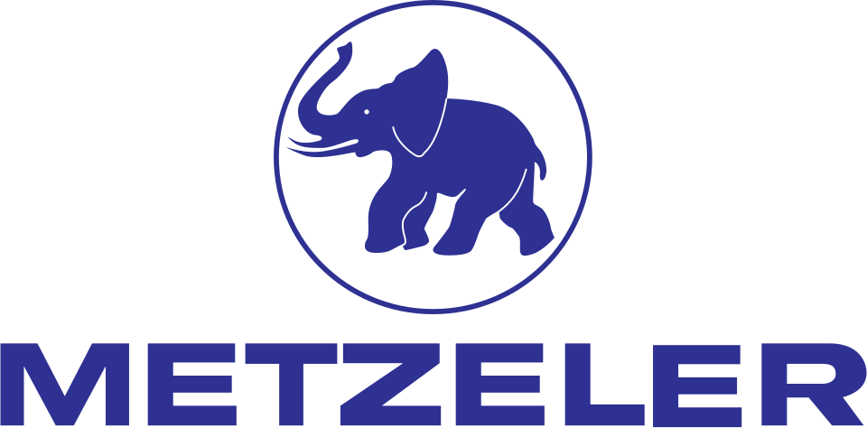
The trademark is an elephant, and the reasoning is not subtle: an elephant means weight-bearing, toughness and endurance, and it reads perfectly as a silhouette moulded into a black sidewall. It is also, usefully, unlike anything else in the category. Since 1986 Metzeler has been part of Pirelli, positioned as the touring and sport-touring specialist alongside Pirelli's own more overtly racing-oriented motorcycle range.
Michelin has been the sole tyre supplier to MotoGP since 2016, having taken over from Bridgestone, and that contract does more for Michelin's motorcycle credibility than any campaign — because a MotoGP grid is, from the tyre's point of view, the most extreme test that exists.
Japan and Korea: chevrons, wordmarks and the geometry of exports
Three of the world's largest tyre makers outside Europe and America are Japanese or Korean, and their logos share a family resemblance: geometric, abstract, wordmark-led, and completely free of mascots.
Yokohama Rubber was founded in 1917 as a joint venture between a Japanese cable manufacturer and the American firm B.F. Goodrich — an export-facing origin that shows in the brand's whole approach. The modern mark is a stylised Y built from angular chevron strokes in red, a form that suggests both a wheel's rotation and a directional tread. It is deliberately abstract: nothing about it is Japanese, or American, or anything else, which is exactly the point for a company selling in a hundred markets.

Yokohama's real brand asset is a sub-brand. ADVAN, launched at the end of the 1970s, is the performance line, and its red-and-black lettering has become a piece of car-culture iconography in its own right — a decal that appears on cars whose owners have never fitted the tyres. Yokohama also spent five seasons as Chelsea's shirt sponsor in the late 2010s, an unusually blunt piece of name-in-front-of-eyeballs buying that makes complete sense for a product nobody looks at.
Hankook began in 1941 as the Chosun Tire Company and took its current name in the late 1960s. Hankook simply means Korea — a nation-branding choice made when Korean manufacturing had no reputation abroad at all, and a confident one in hindsight. The logo is a heavy, slightly condensed wordmark, italicised in most applications, with no symbol.

Hankook's route to credibility has been racing supply rather than advertising: it has been the exclusive tyre supplier to Formula E since the Gen3 era began, and has supplied DTM and other touring car series for years. Formula E is a shrewd fit — a series defined by efficiency, where tyre rolling resistance is genuinely part of the engineering story.
Kumho grew out of a Gwangju transport business — the group's origins are in taxis, not rubber — and entered tyre manufacture in 1960 under a different name before consolidating under the Kumho identity. Its logo is a wordmark paired with a curved device, red and blue, that reads as motion.
All three Asian majors made the same strategic bet, decades apart: skip the mascot, build a wordmark that survives translation, and buy credibility through motorsport and original-equipment fitment rather than through storytelling. It has worked. Hankook and Kumho tyres now leave European and American factories on new cars, which is the only endorsement that most buyers unconsciously trust.
The specialists: Nokian, Maxxis and the orphaned Uniroyal
Not every tyre brand chases the whole market, and the ones that don't have often ended up with the clearest identities.
Nokian Tyres is Finnish, and shares its origin with the mobile phone company — both descend from industrial operations in the town of Nokia, and Nokian Tyres was separated from the Nokia corporation in the late 1980s. Its entire brand is winter. The company introduced a purpose-built winter tyre in the 1930s and named its flagship line Hakkapeliitta, after the Finnish cavalry of the Thirty Years' War — a name almost impossible for non-Finns to pronounce, which Nokian has never once considered changing, because the difficulty is the point.

Nokian's recent history is a case study in geopolitical risk: the company had built much of its capacity in Russia, exited after the 2022 invasion of Ukraine, and has had to reconstruct its manufacturing base in Europe, including a new plant in Romania.
Maxxis is the export brand of Cheng Shin Rubber, founded in Taiwan in 1967. The name is invented — a coinage built to sound maximal in any language — and the brand has become genuinely dominant in a niche most car drivers never think about: mountain bike tyres, where Maxxis tread patterns have names that riders discuss the way audiophiles discuss cartridges.

Uniroyal is the industry's most interesting orphan. It began as the United States Rubber Company, one of the great American industrial combines, and adopted the Uniroyal name in the 1960s. Michelin acquired the American business in 1990; Continental holds the European rights. The result is two Uniroyals with different owners and different positioning — in Europe the name has been built around wet-weather performance, in North America it survives as a value brand.
The company also left behind one of the great pieces of roadside Americana: the Uniroyal Giant Tire beside the freeway in Dearborn, Michigan, a genuine repurposed Ferris wheel from the 1964 New York World's Fair, which has stood there ever since as an eighty-foot advertisement for a company that no longer exists in the form that built it.
India's tyre logos: a muscleman, a cable company and an apollo
India built a full domestic tyre industry from near zero, and its logos are correspondingly less polished and considerably more memorable than the global majors'.
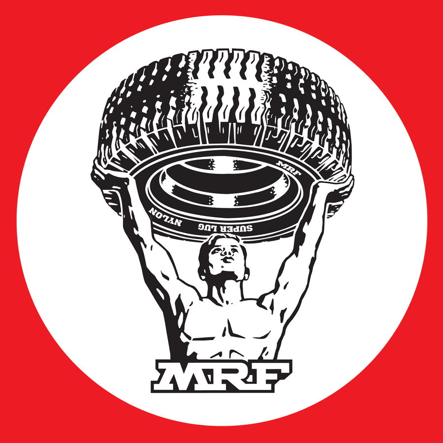
MRF is the outlier of the whole category. It began in 1946 in Madras as a factory making toy balloons, founded by K.M. Mammen Mappillai, and moved into tyre manufacture in 1961 through a technical partnership with an American firm. Its logo is a muscleman — a flexing bodybuilder in silhouette, arms raised — which is the least subtle possible way of saying "strong tyre" and works flawlessly for exactly that reason.
MRF understood sponsorship earlier and more shrewdly than most. The MRF Pace Foundation, established in the 1980s under Dennis Lillee, produced a generation of Indian fast bowlers. And the MRF decal on Sachin Tendulkar's bat put a tyre logo in front of the largest cricket audience on earth for well over a decade — a placement worth vastly more in India than any Formula 1 sidewall.
CEAT has an origin that catches people out: the letters stand for Cavi Elettrici e Affini Torino, an Italian electrical cable manufacturer founded in the 1920s. The Indian operation was established in the 1950s and acquired by the RPG Group in the early 1980s, at which point the Italian name stayed and the Italian company's involvement did not. CEAT, like MRF, has spent heavily on cricket.

Apollo Tyres, founded in the early 1970s, took the internationalisation route: it bought the Dutch manufacturer Vredestein in 2009, giving it a European premium brand and European plants overnight, and later put its name on Manchester United's advertising. An attempted acquisition of America's Cooper Tire collapsed in 2013 — a reminder that the industry's consolidation story includes as many failed deals as completed ones.

JK Tyre claims the first radial tyre manufactured in India, in the late 1970s, and has since acquired manufacturing in Mexico. Its identity is a plain corporate wordmark, inherited from the wider JK industrial group — the least distinctive logo in this article, and a good illustration of what happens when a tyre brand is one division of a conglomerate rather than the whole story.
China's challengers and the problem of an unearned name
The fastest-growing tyre brands in the world right now are Chinese, and they face the branding problem in its purest form: they must sell a safety-critical product on price, into markets that are instinctively suspicious of the price.
Linglong — Shandong Linglong Tyre — has been the most aggressive about buying visibility, taking sponsorship positions with European football clubs, which is precisely the Yokohama-at-Chelsea play executed a decade later. The name means something closer to "exquisite" or "finely wrought" in Chinese; it is not an obvious export name, and the company has largely let the Latin letterforms do the work rather than translating.

Sailun, founded in Qingdao in 2002, is barely two decades old and already ships worldwide. Its pitch is technical rather than emotional — proprietary mixing processes, rolling-resistance claims — which is the correct strategy for a challenger with no heritage to sell.

Triangle Tire, from Weihai in Shandong, has the most literal logo in the industry: a triangle. It is also, arguably, the smartest of the three marks, because a triangle needs no translation, no explanation and no cultural context. It moulds beautifully into a sidewall and it is impossible to get wrong at any size.

The strategic gap is stark. Michelin can sell a century of Bibendum and a restaurant guide. Linglong is selling a tyre that costs less. Closing that gap takes decades, and the Chinese majors are visibly attempting the same route the Koreans took in the 1990s: original-equipment contracts first, retail brand preference later.
Designing for a steel mould
It is worth spending a moment on the physical constraint, because it is genuinely unusual and it has shaped every mark in this article.
A sidewall logo is not printed. It is formed when uncured rubber is pressed into an engraved steel mould under heat and pressure. That imposes a specific and unforgiving set of rules:
| Constraint | Design consequence |
|---|---|
| Single material, single colour | No colour coding, no gradients; the mark must work as pure shape |
| Low relief on a curved surface | Heavy strokes; thin lines vanish under dirt and shadow |
| Read at an angle, in motion, often dirty | Wide letterspacing, high x-height, strong silhouette |
| Mould tooling cost and wear | Simple geometry; fine detail is expensive and degrades |
| Must survive flex and abrasion | Rounded terminals; sharp inside corners crack |
This is why the category's successful marks are almost all silhouettes or heavy letterforms, and why they age so slowly. A logo that has to work as a shadow cannot chase visual trends. Bibendum survives because his outline is unmistakable at any size. The winged foot survives because it is a profile with no interior detail. Triangle's triangle survives because it is a triangle.
It also explains something you may have noticed without registering it: tyre sidewalls are enormously crowded with other type — size codes, load and speed ratings, DOT and E-mark identifiers, tread wear grades, country of manufacture, the week-and-year date code. The brand mark is competing for attention against a dense field of regulatory text, in the same colour, at the same relief. Winning that fight requires being physically bigger and structurally simpler than everything around it, which is exactly what these logos are.
Motorsport is the marketing budget
Every major tyre company's advertising strategy ultimately reduces to the same sentence: be the tyre at the race people watch.
The logic is airtight in a way it isn't for other sponsors. A bank on a Formula 1 car is borrowing the sport's glamour. A tyre supplier in Formula 1 is demonstrating the actual product doing the actual job at the limit of what is physically possible, in front of an audience that is being told about tyre degradation every three minutes by the commentary team. There is no other category where sponsorship and product demonstration are the same activity.
| Series | Supplier | Nature of the deal |
|---|---|---|
| Formula 1 | Pirelli | Sole supplier since 2011 |
| MotoGP | Michelin | Sole supplier since 2016 |
| NASCAR Cup Series | Goodyear | Sole supplier since the late 1990s |
| IndyCar / Indianapolis 500 | Firestone | Sole supplier for most of the modern era |
| Formula E | Hankook | Sole supplier from the Gen3 era |
| World Endurance / Le Mans | Michelin and others | Long-running premium association |
Note that most of these are sole supply deals, and that is not an accident. Open tyre competition in racing has a bad history. When two manufacturers fight over lap time, development costs explode, safety margins shrink, and the sport gets a story it does not want — the 2005 United States Grand Prix, where a tyre failure risk left only six cars able to race, remains the industry's cautionary tale. Formula 1 responded by going to a single supplier, and the pattern held.
For the tyre companies, sole supply is close to ideal. You get every car on the grid, guaranteed screen time, no risk of your rival winning, and a controlled technical narrative. What you lose is the ability to claim you beat anyone — which is why the marketing language around these deals talks about extreme conditions and engineering partnership rather than victories.
The exception, and it is instructive, is Michelin, which built its motorsport identity in endurance racing and rallying where the tyre genuinely is the differentiator over a long distance, and which returned to MotoGP precisely because two-wheeled racing exposes tyre behaviour more visibly than any other discipline.
What to look at next time you're waiting for a fitting
The next time your car is on a lift and you have twenty minutes and bad coffee, go and look at the sidewall properly.
Find the brand mark and notice how much bigger and simpler it is than everything around it. Find the date code — four digits, week and year — and work out how old the rubber actually is. Notice whether the maker put its name on the tyre once or three times around the circumference, and ask yourself who that repetition is for, given that the wheel arch hides most of it.
Then consider the economics of the thing you are about to buy. Somewhere in the price is a share of a photography commission that has run since 1964, an airship fleet operating over American stadiums, a restaurant inspection system employing anonymous reviewers across dozens of countries, and a sole-supply contract with a global racing series. None of it makes the tyre grip any better. All of it exists because a black rubber ring cannot advertise itself.
That is the argument of this whole category, made by a company in Clermont-Ferrand in 1894, when two brothers looked at a pile of their own stock and saw a man standing there.


