
Stand in any supermarket car park in Europe or North America and count the badges. You will find a blue oval, a blue-and-white roundel, a blue-and-white circle with a V and a W stacked inside it, a blue oval with six stars, a blue oval with a slanted H, and a chrome circle with an arrow and a deep blue bar across it. Ford, BMW, Volkswagen, Subaru, Hyundai and Volvo — six of the highest-volume brands on the planet, and every one of them arrives at the same corner of the colour wheel.
That is not a coincidence, and it is not quite a conspiracy either. It is what happens when a hundred years of heraldry, national racing rules, printing economics and consumer psychology all push in the same direction. Blue is the colour a company chooses when it wants you to believe the car will start tomorrow morning.
The blue cluster, and how big it actually is
Blue is the most-preferred single colour in the majority of large cross-cultural preference surveys, and it is the least likely of the primaries to carry a strongly negative meaning anywhere. Red is celebration in China and mourning in parts of southern Africa. White is purity in one hemisphere and funerary in another. Blue is sky and water everywhere humans live, and its cultural associations cluster tightly around calm, depth, distance and dependability.
For a mass-market car company selling in 150 countries, that near-universality is worth more than any individual shade. You are not choosing blue because blue is beautiful. You are choosing blue because it is the colour least likely to mean something inconvenient in a market you have not entered yet.
The second reason is narrower and more interesting. In brand-perception research, colours map loosely onto two axes that marketers borrow from social psychology: warmth and competence. Red, orange and yellow read warm — sociable, energetic, impulsive. Blue reads competent — capable, honest, unhurried. A sports car wants warmth. A family estate that has to survive a school run for eleven years wants competence. Most cars sold are the second kind.
Ford's blue oval: the accidental industry standard
The Ford script came first, and it came from a person rather than a committee. Childe Harold Wills, Henry Ford's first chief engineer and a man who had run a printing sideline as a teenager, is credited with setting the flowing "Ford" signature using his own lettering stencils in the first decade of the century. That script has survived, essentially intact, longer than almost any other mark in industry.
The oval came later. Ford of Britain used an oval surround early on, and the shape was adopted in the United States around the launch of the Model A in 1927 — the moment Ford needed to say, loudly, that the Model T era was over and something new had arrived.
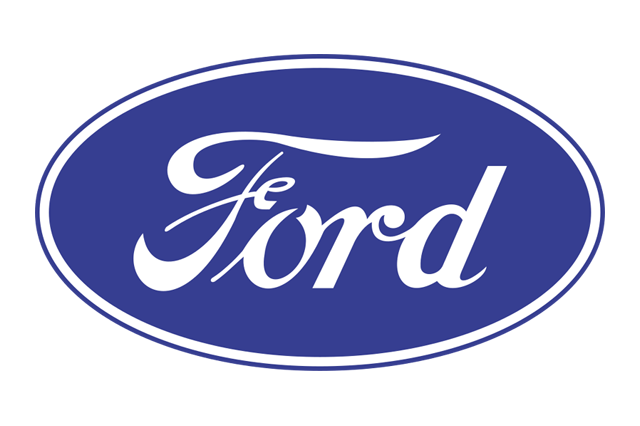
The blue we now think of as inseparable from Ford was not fixed until much later. Through the 1930s and 1940s the oval appeared in black, in chrome, in whatever the sheet metal and the print budget allowed. The deep, slightly greyed blue that became the corporate standard was formalised in the 1970s, when Ford — like every large manufacturer at the time — finally built a proper corporate identity manual with a specified ink rather than a vague instruction to "use blue".
That 1976 badge is the direct ancestor of everything since. The 2003 centennial version added chrome bevels and a glassy highlight, because that was what every logo did in the early 2000s. More recent revisions have quietly reversed the process, flattening the bevel and thinning the outline for screens.
Volkswagen: blue by way of Wolfsburg
The VW monogram is one of the great pieces of engineering-office graphic design, credited to Franz Xaver Reimspiess, an engineer in Ferdinand Porsche's office in the late 1930s. It is simply a V above a W in a circle — but the proportions are so well judged that it has survived a dozen redraws without ever losing its identity.
What is striking is that it was not born blue. The pre-war and immediate post-war versions were black-and-white, and the factory itself spent 1945 under British Army control, with Major Ivan Hirst persuading the occupation authorities that a bombed-out plant making a strange rear-engined saloon was worth keeping alive. Blue arrived in the 1960s as the company built a modern corporate identity to match its position as Europe's largest carmaker.


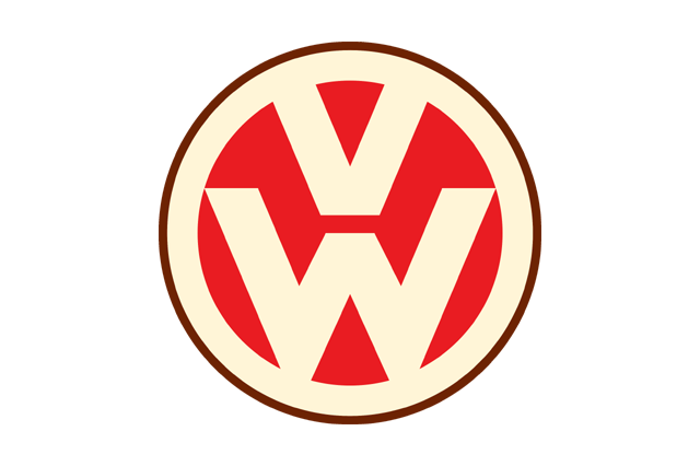



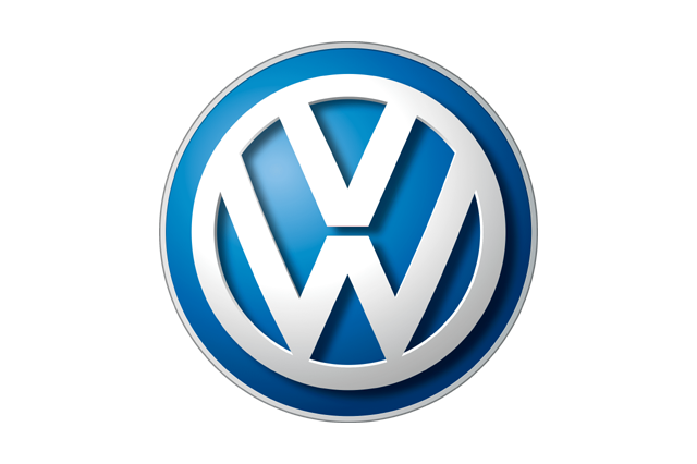
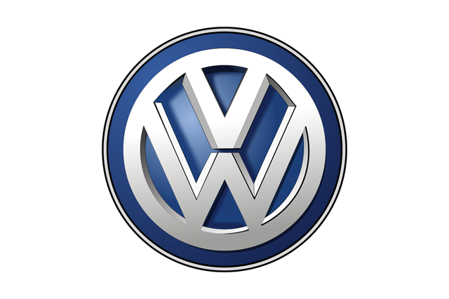

Look at that sequence and you can read the twentieth century in it: the ornamental cogwheel of the 1930s, the austere post-war circle, the confident blue of the 1960s and 1970s, the chrome three-dimensionality of 1999 and 2000, and then the abrupt reversal in 2019 — a two-dimensional, single-weight, screen-native mark launched alongside the ID. electric range. Volkswagen described that redesign explicitly as a logo built for a world of small screens and voice interfaces rather than one of chrome grille badges.
BMW's roundel and the propeller that never was
Everyone has heard that the BMW roundel represents a spinning propeller against a blue sky. It is a lovely story, it fits the company's aero-engine origins, and it is not true.
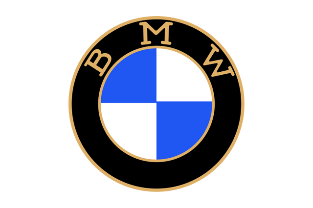
Bayerische Motoren Werke took its name in 1917, and the trademark registered that year borrowed the black outer ring and typography of Rapp Motorenwerke, the predecessor firm, filling the centre with quartered white and blue. Those are the colours of the Free State of Bavaria. They appear in reverse order — blue-white rather than white-blue — because trademark law of the period barred the use of state coats of arms and their emblems in commercial marks, and flipping the sequence was the polite workaround.
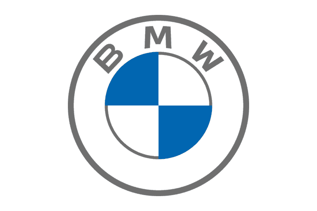
The propeller myth can be dated with unusual precision to a BMW advertisement of 1929, which showed the roundel superimposed on a spinning aircraft propeller. The company was selling aero engines and the image was pure marketing, but it was so good that it detached from its source and became folklore. BMW itself has since gone on the record confirming the Bavarian origin.
Note what the misattribution reveals, though. People want the blue to mean sky, engineering, flight. That instinct is exactly why blue works.
Subaru's six stars and the arithmetic of a merger
Subaru is the Japanese name for the Pleiades, the open star cluster known in Japan as Mutsuraboshi — the six stars. The badge is a literal illustration of a corporate history.
Fuji Heavy Industries was formed in 1953 when five companies, all descended from the break-up of the wartime Nakajima Aircraft works, were reunited into a single firm. The badge shows one large star and five smaller ones: the parent and its five constituents. Kenji Kita, the executive who pushed the name through, wanted something Japanese rather than a borrowed European word, which was unusual for the period.
The blue is doing double duty here. It is night sky, which the imagery demands. It is also, conveniently, the exact register of quiet competence that Subaru's engineering-led positioning — symmetrical all-wheel drive, boxer engines, crash-test performance — has traded on for forty years.
The rest of the blue bench
Volvo wraps blue inside silver. The circle-and-arrow is the ancient alchemical and astrological symbol for iron and for Mars, chosen by founders Assar Gabrielsson and Gustaf Larson in 1927 to signal Swedish steel — and the company name is Latin, the first person singular of volvere, "I roll", inherited from an SKF ball-bearing brand.
The blue is confined to the horizontal bar carrying the wordmark, which is a smart piece of design: the silver ring does the premium work, the blue bar does the trust work, and the two never compete. Volvo has since introduced a flat, monochrome version for digital use, but the chrome-and-blue badge remains the one most people picture.
Hyundai adopted its slanted H in the early 1990s. The company's own explanation is that it depicts two figures — the manufacturer and the customer — shaking hands, which is precisely the sort of thing a brand-consultancy deck produces, and precisely the sort of thing a brand fighting a quality reputation needs. The oval is blue. Of course it is.
Chrysler is blue in the middle. The current badge is a pair of chrome wings — a revival of a 1930s motif, reintroduced in the late 1990s — with a deep navy lozenge at the centre carrying the name. American premium brands have always leaned on wings and blue enamel; it is the visual grammar of aviation-era optimism.
Suzuki is the interesting exception that proves the rule. The famous stylised S is red, and has been since the late 1950s. But the wordmark beneath it is blue, and it is the wordmark that carries most of the brand's presence in print, on dealer signage, and across Suzuki's marine and outboard business.
That split — hot mark, cool name — is a common compromise. It lets a company keep an energetic symbol while grounding the whole lockup in something calmer.
Red: the colour that costs you something
Red is the highest-arousal colour in the spectrum. It measurably raises attention and, in some studies, physiological arousal. It is also the colour that photographs worst, fades fastest in sunlight, and is hardest to reproduce consistently across screens, print and painted plastic. Choosing red is a commitment.
Ferrari is the archetype, and Ferrari's red is not really about the badge at all. Rosso corsa was Italy's assigned national racing colour under the pre-war international motorsport convention, in the same way Britain got green and France got blue. Italian cars raced red because the rulebook said so, and Italian cars won often enough that the colour and the concept of speed fused permanently in the public mind.
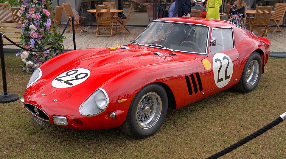
The Prancing Horse itself has nothing to do with red. Francesco Baracca, Italy's leading fighter ace of the First World War, carried a rearing horse on his aircraft. Enzo Ferrari's account is that Baracca's mother, Countess Paolina, suggested he adopt it for luck. The yellow field behind the horse is giallo Modena — the civic colour of Modena, Enzo's home city. So Ferrari's badge is technically a yellow logo. The red is the paint.
Alfa Romeo splits the difference in the most literal way in the industry: a red cross on white, the arms of Milan, beside the Visconti biscione, the crowned serpent, on blue. Heraldry, not marketing. The badge dates from the A.L.F.A. era around 1910 and has been redrawn perhaps a dozen times without ever abandoning that two-halves structure.
Ducati runs red for the same reason as Ferrari — Bologna, racing, Italy — and has resisted every temptation to soften it. Toyota, by contrast, uses red almost entirely in its wordmark rather than its symbol. The three overlapping ellipses adopted in 1989 for the company's fiftieth anniversary are rendered in chrome on the car, but the corporate red of the Toyota name has been the constant in advertising for decades.
Kawasaki deserves a footnote, because it is routinely miscategorised. Kawasaki Heavy Industries' corporate mark and River Mark are red. The lime green that everyone associates with Kawasaki is a racing livery, adopted around the early 1970s and, according to the widely repeated account, chosen partly because green was considered unlucky in motorsport and the team enjoyed the defiance. Two colours, two jobs — the corporate one is red, the emotional one is green.
Silver and chrome: engineering you can see
Silver is not a hue. It is a finish, and that is the entire point. A chrome badge changes with the light, which means it behaves like machined metal rather than printed ink. It is the closest a logo can get to being an engineering component.
Mercedes-Benz built its entire identity on this. The three-pointed star traces to Gottlieb Daimler, who is said to have marked his house on a postcard to his wife Emma with a star, and the three points were later given the meaning of motorisation on land, on water and in the air. The star was registered as a trademark in 1909; the encircling laurel wreath followed the 1926 merger of Daimler and Benz, combining the star with Benz's laurel.
Germany's assigned racing colour was white, and the origin story of the Silver Arrows — that in 1934 a Mercedes was found a kilogram or so over the class weight limit and the white paint was scraped back to bare aluminium overnight — is repeated so often that it has become fact by attrition. Historians treat it sceptically. What is not in doubt is that German racing cars ran bare metal through the late 1930s and that silver became a national signature.
Audi turned silver into geometry. The four rings represent the 1932 merger of Audi, DKW, Horch and Wanderer into Auto Union — four companies, four interlocking circles, one of the very few logos in any industry that is a literal corporate org chart.
August Horch, having left the firm bearing his own name after a boardroom dispute, needed a new one he could legally use. A colleague's son, studying Latin, is said to have suggested audi — the imperative of audire, "hear", which is what horch means in German. The rings were chromed for most of their modern life; Audi flattened them in 2016 and moved to a purely two-dimensional black-and-white system in the 2020s.
Aston Martin and Rolls-Royce use metal differently again, as jewellery rather than machinery. Aston's wings have carried a green enamel field with gold lettering for most of the modern era, simplified and flattened in the 2020s. Rolls-Royce's interlocked RR monogram was red until 1933, when it changed to black. The popular explanation ties this to Henry Royce's death that year; the company has indicated the decision predated it and was aesthetic — black simply worked better against more body colours.
That is the unglamorous truth behind a lot of badge colour decisions. The badge has to sit on every paint option in the brochure.
Yellow and gold: seen from further away
Yellow has the highest luminance of any saturated hue. On a black or dark background it is the most legible colour combination available to a designer, which is why it dominates road signage, taxis, and warning labels. In automotive branding it does three jobs: visibility, heritage, and warmth without red's aggression.
Chevrolet's bowtie has been gold since the mid-2000s, when GM standardised it across the range, though the shape dates to 1913. Its origin is genuinely disputed and always will be: William C. Durant claimed he copied it from wallpaper in a Paris hotel; another account has him seeing it in a newspaper advertisement for a coal product called Coalettes; his wife later recalled him sketching it at the dinner table. Pick your favourite. The gold works because it reads warm against the chrome and dark paint most trucks wear, and because it survives being reduced to the size of a steering-wheel boss.
Renault is the European yellow. The losange diamond dates to 1925, and its most famous form is the 1972 redrawing attributed to the op-art painter Victor Vasarely, all parallel lines and optical illusion. The yellow field arrived later, in the early 1990s, and rapidly became inseparable from Renault Sport and the company's Formula One programme.
Then in 2021 Renault threw the yellow off the badge entirely, returning to a bare interlocking-line diamond that reads as a single continuous ribbon. The yellow survives in the brand system around the logo rather than inside it — a pattern you will see repeated across the industry in the next section.
Opel pairs yellow with black in its wider brand system while keeping the Blitz itself monochrome. The lightning bolt arrived in 1935 and is a direct reference to the Opel Blitz truck — one of the few logos in the industry named after a specific product rather than the other way round.
And Ferrari, again: the yellow shield is not decoration but civic identity, and the difference between the rectangular badge and the shield-shaped one is a real distinction, with the shield historically tied to Scuderia Ferrari and competition.
Green: heritage first, ecology second
Green in the car industry means Britain before it means anything environmental.
British racing green comes from the Gordon Bennett Cup era at the start of the twentieth century. When the 1903 running of the race was held in Ireland — Britain having won the right to host it, but lacking a legal venue on the mainland for closed-road racing — the British entries ran in a shade of green as a courtesy to the Irish hosts. The colour stuck, and it darkened over the following decades into the near-black green of Bentley, Jaguar, Lotus and Aston Martin at Le Mans.
Land Rover has used a green oval since the vehicle's Amsterdam launch in 1948. That green is not racing green; it is the colour of the utilitarian, agricultural, ex-military world the original was built for, and Land Rover has never let go of it even as the products moved several income brackets upmarket.
The awkwardness is what happened next. Once green acquired an unambiguous ecological meaning in the 1990s, it became almost unusable for a car company: any manufacturer putting green on a badge would be read as making an environmental claim it could not support. That is a large part of why the electric transition, which you might expect to have produced a wave of green logos, produced almost none.
Black: subtraction as luxury
Black is the easiest colour to specify and the hardest to earn. It carries no information, which is exactly its value: a black badge says the object it sits on does not need help.
Lamborghini's shield is black with a gold bull. Ferruccio Lamborghini was born in late April 1916, under Taurus, and his interest in fighting bulls was real — he visited the ranch of the breeder Don Eduardo Miura in the early 1960s, and Miura, Islero, Espada, Jarama, Urraco and Diablo all take their names from bulls or bullfighting. The black-and-gold combination is deliberately the opposite of Ferrari's yellow-and-red: cooler, heavier, more nocturnal.
KTM does the opposite thing with the same logic — an aggressive orange wordmark on black, with the orange doing all the shouting and the black providing the ground for it. The name comes from Kronreif, Trunkenpolz and Mattighofen, and the orange has been the company's signature since the 1990s.
Black also has a purely practical advantage in the current era: it is the only "colour" guaranteed to reproduce identically on paper, on a screen, in a laser etch, on a debossed leather headrest and as a shadow on a white body panel.
The national colour code, and what survives of it
Before commercial sponsorship arrived in the late 1960s, international motor racing assigned colours by nationality rather than by sponsor. The system is dead as a rule and very much alive as a set of associations.
| Nation | Racing colour | Where it still shows up |
|---|---|---|
| Italy | Rosso corsa | Ferrari, Alfa Romeo, Ducati, Abarth |
| Britain | British racing green | Bentley, Lotus, Aston Martin heritage liveries, Land Rover |
| France | Bleu de France | Bugatti's heritage blues, Alpine, Matra |
| Germany | White, later bare-metal silver | Mercedes-Benz, Audi, the "Silver Arrows" name |
| United States | White with blue stripes | Shelby, Ford GT heritage liveries |
| Belgium | Yellow | Vintage racing, occasional special editions |
| Japan | White with a red disc | Japanese heritage and endurance liveries |
Read that table and a lot of modern badge colour makes sense. German brands are silver because Germany raced silver. Italian brands are red because Italy raced red. British brands are green. The convention was arbitrary when it was set, and it has outlived every rule that enforced it.
The flat turn: why every badge went two-dimensional
Something happened to automotive logos between roughly 2015 and 2025 that had not happened since the 1970s: nearly all of them changed at once, and they changed in the same direction.
Volkswagen went flat in 2019. BMW introduced a transparent, two-dimensional roundel for communications in 2020 — keeping the physical car badge three-dimensional. Toyota, Nissan, Kia, Peugeot, Renault, Volvo, Audi, General Motors and Bentley all did comparable things within a few years of each other. Chrome bevels, drop shadows, glass highlights and gradients were stripped out; line weights were unified; colour palettes shrank, often to one colour or none.
There are four forces behind it, and none of them is fashion alone.
Screens. A badge now spends more of its life at 32 pixels wide in a browser tab, an app icon, or a car's own infotainment splash screen than it does on a bonnet. Bevels and gradients turn to mud at that size. A single-weight outline does not.
Backlighting. Illuminated badges — grille logos that glow — require a mark that can be rendered as an even light-emitting surface. You cannot backlight a chrome gradient. You can backlight a flat outline beautifully.
Radar. Modern driver assistance puts a radar emitter behind the grille, frequently directly behind the badge. Metal blocks radar, so the badge became a carefully engineered plastic radar window with a thin metallised finish — a construction that favours flat, layered forms over deep chrome castings.
Electrification. Electric cars have no radiator to cool and therefore no grille to fill. The badge lost its traditional frame and had to survive alone on a smooth panel, which rewards a mark with a strong silhouette and punishes one that relies on shine.
What the electric brands did instead
If colour signals category, then a brand entering a new category has a decision to make: borrow the existing cues or refuse them. Most of the electric-native manufacturers have refused them.

Polestar uses a monochrome mark derived from the points of a star, deployed almost entirely in black-and-white with a brand system built on grey, concrete and glass. Lucid runs a restrained wordmark rather than a symbol. Tesla's stylised T — which the company has described as a cross-section of an electric motor, with the rotor and a pole piece — is used in flat red or plain monochrome, with none of the chrome depth a conventional manufacturer would have applied to it a decade earlier.
The absences are as telling as the choices. There is no green. There is almost no chrome. There is very little blue, which is remarkable given that blue is the default trust colour of the entire legacy industry — and which is precisely the point. A brand arguing that the old industry got it wrong cannot dress in the old industry's colours.
Rivian is the deliberate exception, running a bright yellow that reads outdoors, adventure and equipment rather than technology. It works because it is the only one doing it.
A working decoder for badge colour
| Colour | What it signals | Typical user |
|---|---|---|
| Blue | Reliability, engineering, calm competence | High-volume mainstream brands |
| Red | Speed, passion, national racing identity | Italian marques, performance sub-brands, motorcycles |
| Silver / chrome | Precision, materials, cost | German premium, luxury saloons |
| Gold | Warmth, heritage, permanence | American mass-market, Italian supercars |
| Yellow | Visibility, sport, energy | Renault, Opel, Ferrari's shield, Rivian |
| Green | British heritage, utility, and now an environmental claim | Land Rover, Bentley and Lotus liveries |
| Black | Restraint, luxury, technical seriousness | Supercars, premium sub-brands, most 2020s rebrands |
| None (monochrome) | Modernity, software, category refusal | Electric-native brands and recent redesigns |
The table is a starting point, not a law. Every one of these associations was formed by accident somewhere and then reinforced by repetition until it became a rule that new entrants have to either obey or consciously break.
Try this on your own street
Next time you are stuck in traffic, do the count properly. Note the badge colour of every car in view, then note whether the colour comes from the symbol or from the wordmark — those are very often different decisions made decades apart, as Suzuki's red S over blue lettering and Toyota's chrome ellipses over a red name both demonstrate.
Then ask the harder question about the cars registered in the last two or three years. How many of their badges have any colour at all? The industry spent a century deciding what blue and red and silver meant, and it is currently in the middle of deciding whether it needs them.


