
Stand in front of a dealership badge wall photographed in 2017 and one taken in 2022 and you are looking at two different industries. The first is a display case of jewellery: polished chrome rings, bevelled edges catching a studio light, blue gradients that fade from sky to navy, soft drop shadows implying that each emblem floats a few millimetres off the wall. The second looks like a set of icons on a phone. Thin lines, no depth, one colour — usually black or white — and an unnerving amount of empty space.
Between roughly 2018 and 2022 almost every mass-market carmaker on earth threw away its three-dimensional badge and replaced it with a flat outline. Volkswagen went first at scale in 2019. BMW followed in March 2020, then Nissan in July. Toyota, Volvo, Renault, Peugeot, Kia, General Motors, Citroën, Škoda, Lancia and Opel all landed inside a three-year window. Lamborghini, one of the last significant holdouts, finally gave in during 2024.
That is not a coincidence, and it is not fashion alone. Four separate pressures — one from Cupertino, one from Brussels, one from the sensor bay behind the grille, and one from the accounting department — arrived at the same moment and pointed in the same direction.
What "flattening" actually meant
It is worth being precise about what changed, because the visual vocabulary of the old badges was remarkably consistent across brands and continents.
The pre-2018 automotive logo almost always carried five effects: a chrome or metallic fill, usually rendered as a vertical gradient with a bright horizon line to fake a reflective cylinder; a bevel, a light edge on top and a dark edge below to suggest a raised surface; a drop shadow; a gloss highlight, that ellipse of white across the top third borrowed wholesale from Apple's early-2000s Aqua interface; and enclosure, a ring or shield or oval that sealed the mark off from the page.
The flat replacements deleted all five. What survives is a single-weight line drawing that can be filled with one colour, inverted to white, animated, or reduced to a monochrome silhouette without losing its identity. Line weights got thinner. Enclosures got optional. Wordmarks were redrawn in bespoke geometric sans-serif faces with wide letterspacing — Volkswagen commissioned one, BMW commissioned one, Nissan and Kia commissioned their own.
The technical term the design industry used was the shift from skeuomorphism to flat design. The automotive industry got there about six years after everybody else.
iOS 7 was the starting gun, and it went off in 2013
The pivot point for the whole visual culture was September 2013, when Apple shipped iOS 7. Under Jony Ive, who had taken over software design the previous year, Apple stripped out the leather stitching in Calendar, the green felt in Game Center, the wooden shelves in Newsstand and the linen textures underneath everything. Icons became flat, brightly coloured, and thin-lined.
Apple was not first. Microsoft's Metro language, shown in Windows Phone 7 and then Windows 8 in 2012, was aggressively flat and typographic, and its designers were openly contemptuous of fake reflections. Google formalised its own answer with Material Design in 2014, which reintroduced a strict, physically consistent notion of elevation — flat surfaces that cast real shadows on a z-axis — as a corrective to flatness that had gone too far.
But iOS 7 was the one that moved the market, because it forced every app developer on the planet to redraw an icon. Within two years the wave reached corporate identity. Google replaced its serif wordmark with a flat geometric sans in 2015. Mastercard removed the gradients from its interlocking circles in 2016. Airbnb, Uber, Spotify, Pfizer and a long list of others followed.
The car industry watched this happen and, characteristically, waited. Product cycles in automotive run five to seven years; brand identity systems are refreshed even more slowly, because they are baked into dealer signage, service manuals, press fleets, factory tooling and trademark portfolios in ninety countries. When the industry finally moved, it moved almost all at once — partly because the pressure had been building for half a decade, and partly because nobody wanted to be the last brand still using a 2004 gloss highlight.
There were early movers. Audi flattened its four rings in 2016, dropping the chrome tube rendering for a plain monochrome outline. MINI had already gone flat with its winged roundel in 2018. Mercedes-Benz had been quietly using a flat, single-colour three-pointed star in print and digital contexts since the early 2010s, even while the cars kept their glorious chromed hood stars.
The favicon problem: one mark, sixteen pixels
Here is the practical engineering constraint that broke the old badges.
A 2015 automotive logo was designed to be experienced at two sizes: about 120mm across on a grille, and about a metre across on a dealership pylon. Both are large, both are lit, and both are physical objects where a bevel genuinely catches light. The design worked because the medium cooperated.
By 2019 the dominant experience of a car brand's mark was a 32-pixel favicon in a browser tab, an app icon on a phone home screen, a circular avatar on Instagram, a watermark in the corner of a YouTube pre-roll, a tile in a comparison grid on a classifieds site, and — increasingly — a graphic drawn by the car's own infotainment system on start-up. At 32 pixels a chrome gradient is four grey pixels that read as mud. A drop shadow becomes a smear. A gloss highlight disappears entirely or, worse, survives as a single bright dot that looks like a rendering error.
Designers call this the reduction test, and every legacy car badge failed it. The fix is a mark built from strokes of consistent weight with generous internal gaps, which survives being scaled down, thresholded to pure black and white, embroidered, laser-etched, or drawn by a plotter in a single continuous path.
The same constraint pushed brands toward responsive identity systems — a family of marks rather than one. Most of the 2019–2022 rebrands shipped with at least three tiers: a full lockup with wordmark for large formats, a reduced symbol-only version, and a simplified single-colour app-icon version. That is a systems problem, and systems problems favour geometry over illustration.
Volkswagen, September 2019: the starting gun for cars
Volkswagen unveiled its new identity at the Frankfurt motor show in September 2019, on the same stand and in the same week as the ID.3, its first purpose-built electric hatchback. That pairing was the entire point.
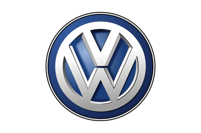
The old mark, in service since the early 2000s and refined in 2012, was a chromed VW monogram inside a chromed ring, sitting on a blue field with a vertical gradient and a soft shadow. It was, frankly, one of the better-executed chrome badges — legible, balanced, unmistakably German.
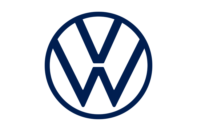
The new one is a line drawing. The ring became a thin stroke, the V and W were separated by a visible gap where they used to touch, the gradient went, the shadow went, and the default colour became a single flat blue that inverts cleanly to white. Volkswagen described the identity as two-dimensional, reduced and "digital-first", and rolled it out alongside a new corporate typeface and a redesigned dealer environment.
Two details make the Volkswagen case instructive. First, it was explicitly tied to a corporate reinvention after the diesel emissions scandal — the company needed a visible line between the old Volkswagen and the new one, and a logo change is the cheapest possible signal of that. Second, Volkswagen made the badge on the cars themselves flat too, which not every brand did. Look at an ID.3, ID.4 or the eighth-generation Golf: the front badge is a flat, backlit or unlit disc rather than a chromed sculpture.
BMW, March 2020: the logo that is not for cars
BMW's announcement, in March 2020, generated more argument than any other in the wave, and most of the argument was based on a misunderstanding.
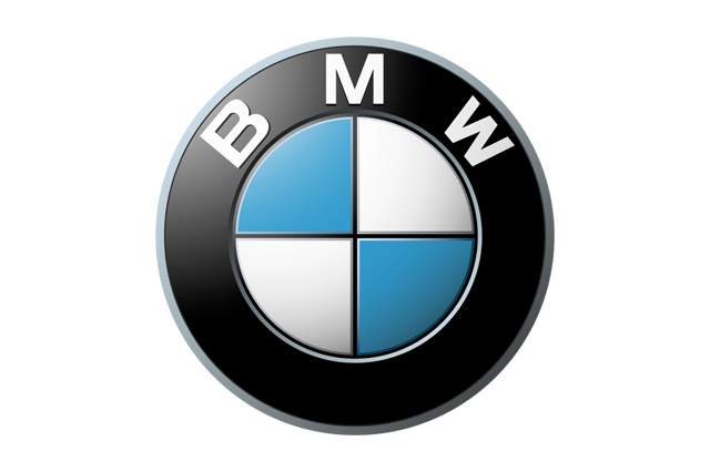
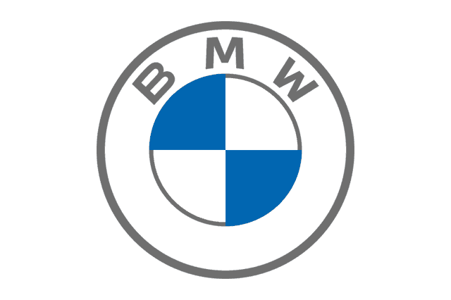
BMW did not replace the badge on its cars. It introduced a communication logo — a version of the roundel with the black outer ring made transparent, the chrome rendering removed, and the whole thing reduced to a flat outline with the blue and white quadrants intact. On a website, a press release, a social post or a screen, the surrounding page colour shows straight through the ring. On the cars, the physical roundel remains a three-dimensional object with a real black ring and a real chrome bezel.
The new mark first appeared publicly on the Concept i4. BMW's stated logic was that a transparent ring lets the logo sit inside layouts, video and photography without punching a black hole in the composition — a genuinely modern typographic argument, and the same reasoning that led broadcasters to make their on-screen bugs semi-transparent.
The change also gave BMW an opportunity to gently correct a myth. The roundel's blue and white quadrants derive from the colours of the Free State of Bavaria, arranged in a circle; the widely repeated story that they represent a spinning aircraft propeller against a blue sky comes from a BMW advertisement of the late 1920s, roughly a decade after the mark was registered. It is a beautiful piece of retroactive storytelling, and BMW has never entirely stopped enjoying it.
Nissan, July 2020: the badge as a light fixture
Nissan revealed its flattened logo in July 2020, immediately ahead of the Ariya electric crossover. This is the redesign where the manufacturing argument becomes impossible to ignore.
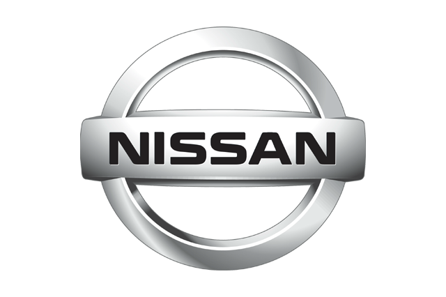
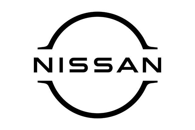
The outgoing badge was a chromed ring bisected by a chromed bar carrying the Nissan name — a direct descendant of the "rising sun" device the company has used in various forms since the 1930s. The new one keeps the geometry but breaks the ring, letting the wordmark extend past the circle on both sides, in a single thin stroke with no fill and no chrome.
On the Ariya, that mark is illuminated. The badge is a moulded, edge-lit assembly containing a set of small LEDs behind a diffuser, and it lights up on approach and unlock. Try to build the same effect with the old badge and you immediately hit the physics: a chromed, compound-curved, three-dimensional emblem scatters and reflects light in a hundred directions, produces visible hot spots over each LED, and needs a bespoke light guide for every contour. A flat, single-plane line drawing of constant stroke width is close to the ideal geometry for even backlighting — it is essentially a light pipe you can draw.
This is why illuminated badges and flat badges arrived together across the industry. It also matters that on an electric car the badge frequently sits on a blanked-off panel where a radiator grille used to be, which is a flat surface with space behind it and nothing else to do.
The chrome problem: REACH, radar and the economics of a bevel
Two less visible forces were pushing in the same direction, and both are worth understanding because they explain the timing better than any design-history argument.
Hexavalent chromium became a regulatory liability
Traditional decorative chrome plating relies on hexavalent chromium, a confirmed carcinogen. Under the European Union's REACH regulation, chromium trioxide was placed on the authorisation list, with a sunset date in September 2017 after which its use in the EU required a specific, expensive, time-limited authorisation. Suppliers across Europe had to apply, justify, monitor and pay — or find alternatives.
The result was a decade-long industry retreat from decorative chrome that shows up everywhere on modern cars, not just badges: gloss-black window surrounds instead of bright trim, painted or satin-anodised finishes, "black pack" option boxes that customers now perceive as sporty rather than cheap. A flat badge printed, moulded or vapour-deposited in a single colour sidesteps the whole regulatory problem.
Chrome is opaque to radar
The modern car's forward radar for adaptive cruise control and automatic emergency braking is almost always mounted behind the front badge, because that is the one place at the centre of the nose with depth behind it. Metallic chrome plating attenuates and reflects millimetre-wave radar, which is precisely what you do not want in front of a sensor.
The industry's answer was radar-transparent badges: multi-layer plastic mouldings with an extremely thin metallic film — typically indium or tin deposited under vacuum — applied in discontinuous islands so the surface looks metallic to the eye while remaining largely transparent to radar. These parts work, but they are far more expensive and far more failure-prone than a plain moulding, and they usually need heating elements to shed ice. Every millimetre of three-dimensional relief makes them harder.
Put those together and a flat, thin, single-colour badge is not just cheaper to draw. It is cheaper to tool, cheaper to plate, cheaper to light, cheaper to make radar-transparent, and cheaper to ship as a hundred file formats to a global agency network. In an industry that fights over fractions of a cent per part, that is a very loud argument.
Toyota and Volvo: the quiet ones
Not every rebrand was announced with a drone show. Toyota's was so restrained that most owners never noticed.
The three-ellipse emblem, introduced in 1989 for the company's fiftieth anniversary, was already a strong piece of geometry — two overlapping ovals forming a stylised T inside a third, with the negative space said to contain every letter of the name. What changed was the rendering: the chrome-and-shadow treatment gave way to a plain outline, and a new flat red TOYOTA wordmark in a bespoke face began appearing in European communications from 2019, spreading through North America and other markets over the following year or two. Toyota also began dropping the wordmark from the emblem lockup entirely in some markets, on the reasonable assumption that the three ellipses no longer need explaining.
Volvo's move came in 2021 and was equally understated.
The iron mark — the circle-and-arrow symbol for iron, a nod to Swedish steel, rather than the Mars symbol it is often mistaken for — lost its metallic fill and its diagonal band, keeping a clean ring with the Volvo name set wide across the centre. The flat version appeared alongside the C40 Recharge and the brand's commitment to an all-electric line-up, which is exactly the same script Volkswagen and Nissan had already followed: new logo, new electric car, same press conference.
France flattens twice, in opposite directions
The two French rebrands of 2021 landed within weeks of each other and took almost opposite approaches, which makes them the most useful pair in the whole wave.
Renault revealed its new diamond in early 2021. Rather than simplify the existing solid, chromed losange, the design team went back to the 1972 mark designed by the Hungarian-French op-artist Victor Vasarely, which rendered the diamond as a set of nested lines creating an optical illusion of depth.
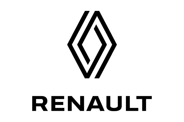
The 2021 logo is a single unbroken line folded into an interlaced diamond — an impossible object in the Escher sense, readable as either two overlapping shapes or one continuous ribbon. It is flat, it is one stroke, it animates beautifully as a line that draws itself, and it is genuinely distinctive at any size. It rolled out on the Mégane E-Tech and then the reborn Renault 5. Laurens van den Acker's design organisation deserves credit for resisting the obvious move, which would have been to simply delete the gradient from the old badge.
Peugeot went the other way and reached even further back.
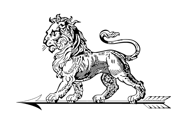
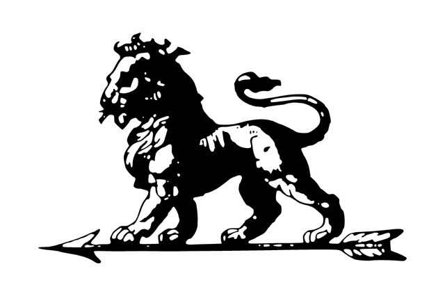
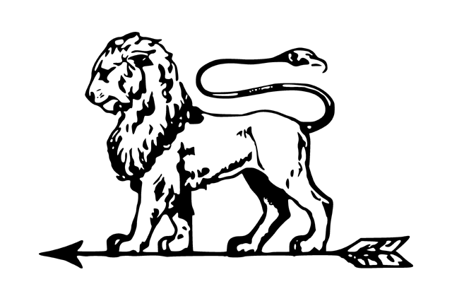
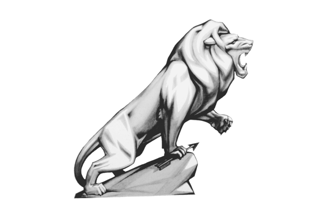

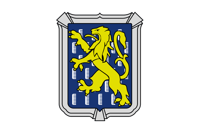
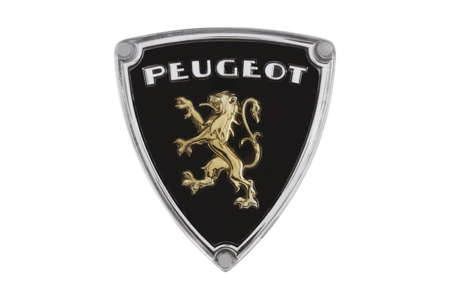
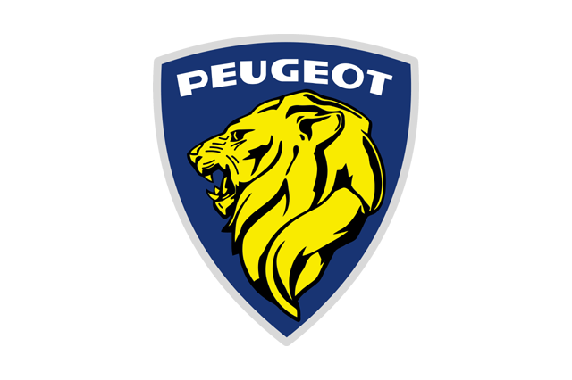
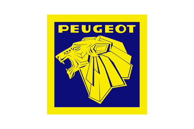
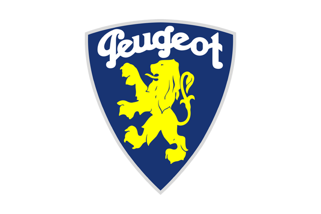

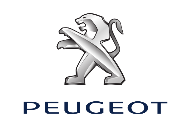
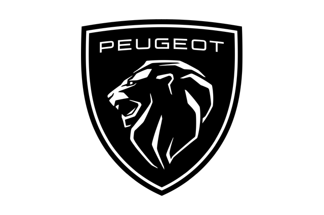
Peugeot has been drawing lions since 1858, when the family's steel business used one to advertise the strength of its saw blades — the marque predates the motor car by decades. The badge cycled through full-body lions, heraldic lions, minimalist wire-frame lions and, from the 1970s onward, an increasingly generic chrome cat. The February 2021 redesign abandoned the standing lion altogether and returned to a lion's head inside a shield, a direct revival of the coat-of-arms treatment Peugeot used in the 1960s.
It is flat, monochrome and works as a monogram, but it is also unmistakably a heraldic device rather than a piece of interface furniture. It debuted on the third-generation 308 and was accompanied by an upmarket repositioning of the whole brand. Of every logo in this period, it is the one most designers name as the best executed, because it solved the digital problem without surrendering the brand's specificity.
Kia, January 2021, and the KN problem
Kia's rebrand was the most radical of the group and the most self-inflicted.

The outgoing logo was a red-and-chrome oval containing the three letters in a conventional serif-ish face — a competent but anonymous mark from the era when Kia was still fighting for credibility. The replacement, launched under the slogan "Movement that inspires", is a single continuous rising stroke that renders K, I and A as one connected gesture, with the oval deleted entirely. Kia launched it with a large-scale drone and pyrotechnic display over the water near Incheon, which the company claimed set a world record for simultaneous drone-launched fireworks.
The mark is genuinely modern, it works at any scale, it animates as a signature being written, and it arrived exactly when Kia needed it — the EV6 landed the same year and the brand's design credibility was climbing fast.
It also has a flaw that has become a piece of internet folklore. Because the I and the A are joined and the K's stroke reads as a vertical, a large number of people see KN. Search-trend watchers noticed a steady stream of queries for "KN car" and "KN motors" after the launch, and the observation has never really gone away. Kia has, to its credit, largely ignored this, on the theory that a logo people argue about is better than one nobody notices — and five years on, the argument has mostly stopped.
General Motors: a logo as an EV manifesto
General Motors changed its corporate identity in January 2021, in a rebrand that had almost nothing to do with cars people buy.
GM's blue square wordmark had been essentially stable since the mid-1960s. The replacement kept the lowercase-versus-uppercase debate alive by rendering gm in soft lowercase inside a rounded square, filled with a blue gradient that runs from a pale, almost electric tone to a deeper one. The underline beneath the m was drawn to evoke a plug, and the whole thing was launched with the "Everybody In" campaign supporting the Ultium battery platform.
This one is different in kind. GM does not sell cars under the GM name; it sells Chevrolet, GMC, Buick and Cadillac. Its corporate mark's audience is investors, regulators, suppliers, recruits and journalists — an audience that reads it on a screen, in a slide deck, on a quarterly earnings graphic. Judged as an EV-era investor signal rather than a badge, it does its job, and it is telling that GM was comfortable using a gradient at the exact moment everyone else was deleting theirs. The gradient here is not fake metal; it is fake energy.
Retro-flat: the counter-current inside the trend
The most interesting sub-plot is that a significant number of brands used flatness as an excuse to go backwards, not forwards.
Citroën's 2022 identity returned to the double chevron inside an oval frame, close to the shape André Citroën registered around 1919 — a device that was never a decorative flourish but a literal diagram of the double-helical gear teeth that made his fortune before he built cars. Škoda in 2022 replaced its green circular badge with a flat, open winged arrow and a spaced-out wordmark. Lancia returned in 2022 to a circular mark echoing its 1950s and 1970s emblems. Opel's 2023 Blitz is a stripped, geometric version of the lightning bolt the company adopted in the 1930s — itself derived from the Blitz truck.
The pattern is consistent: brands with a deep archive discovered that early-twentieth-century logos were already flat, because they were designed for letterpress printing, enamel signage and radiator badges stamped from sheet metal. Nobody put a gloss highlight on a 1919 chevron because there was no way to print one. Going digital-first and going heritage-first turned out to lead to the same drawing.
That is also why the wave produced fewer irreversible mistakes than critics predicted. A brand returning to its own 1930s mark is not chasing a trend; it is re-adopting a solution to the same constraint.
Fashion did it first — and then partly undid it
The car industry's flattening had an almost exact precedent one sector over, and it is worth watching because fashion is roughly five years ahead on the same cycle.
Between 2017 and 2019, Burberry, Balmain, Balenciaga, Berluti and a string of others replaced their crests, scripts and equestrian knights with flat, tightly-spaced geometric sans-serif wordmarks. Burberry's 2018 identity, developed with the graphic designer Peter Saville, deleted the Equestrian Knight that had been in service since the early 1900s in favour of a plain capitalised wordmark. Critics coined the word blanding for the result: a market of luxury houses whose logos had become interchangeable.
Then it reversed. Burberry restored a serif wordmark and brought the knight back in 2023 under a new creative director. Several others softened or retreated. The lesson the fashion houses learned the expensive way is the one that should worry any carmaker that went too far: when every competitor optimises for the same 32-pixel container, the container wins and the brand loses.
Who refused, and why they could afford to
The brands that did not flatten form a very specific list, and the pattern is not subtle.
Porsche refreshed its crest in 2023 and moved in the opposite direction. The update kept the three-dimensional, multi-layered construction, refined the Stuttgart horse, replaced flat gold with a brushed, textured gold finish, and added a fine honeycomb texture to the red fields. It is more crafted than before, not less — a deliberate statement that the crest is an object, not an icon.
Ferrari has kept the Cavallino Rampante essentially unchanged since Enzo Ferrari began using it in the 1930s, with only a wordmark refresh in recent years. The prancing horse's origin — a device from the aircraft of the First World War ace Francesco Baracca, given to Enzo by the pilot's mother — is exactly the kind of story that makes flattening unthinkable. You do not modernise a relic.
Rolls-Royce did rebrand in 2020, with a redrawn Spirit of Ecstasy, a refined interlocking RR monogram and a shift to a distinctive purple as its primary colour. But it flattened nothing that mattered: the mascot is still a hand-finished sculpture, and when it was redesigned again for the electric Spectre it was reshaped for aerodynamics — lowered, leaning further forward, shrinking from just over 100mm tall to around 83mm — rather than simplified for screens.
Bentley, Aston Martin and Morgan all made refinements in this period without abandoning depth, metal or wings.
The economics behind this are straightforward. A brand selling 300,000 cars a year needs its logo to work in a comparison grid on a classifieds site, in a lease-deal aggregator's table, in a fleet manager's spreadsheet and on an app icon competing with two hundred others — contexts where legibility at small size is the entire battle. A brand selling 3,000 cars a year does not compete in those contexts at all. Its customers arrive already knowing the marque; the badge's job is to signal craft, provenance and expense, which are exactly the qualities that flatness deletes.
There is a manufacturing corollary. A cloisonné enamel badge with hand-applied lacquer is a rounding error on a car costing several hundred thousand pounds, and a serious line-item on one costing twenty thousand.
Lamborghini, 2024: the last domino
Lamborghini held out longer than almost anyone, keeping the gold-on-black, heavily bevelled shield it had used since 1998 — a badge that looked like it had been rendered in Photoshop with every layer style switched on at once, which in fairness is roughly what it was.
The 2024 redesign flattened the shield to a clean outline, redrew the bull as a bolder, simpler silhouette with fewer internal details, and set the LAMBORGHINI wordmark in a wider, more even face. The gold survived as a single flat colour rather than a metallic gradient. It arrived alongside the brand's hybridisation programme — the Revuelto, the Urus SE, the Temerario — which needed a visual identity that could carry an electrified message without looking apologetic.
That Lamborghini went last is instructive. It sits in an awkward middle position: exotic enough to trade on mystique, but volume-conscious enough — largely thanks to the Urus — to care about how its badge looks on a phone.
Jaguar, 2024: what happens when the rebrand isn't really about flatness
The most violent backlash of the era arrived after the flattening wave had already peaked, and it was not caused by flatness.
Jaguar had already done a conventional simplification in 2021, cleaning up the leaper and the wordmark. Then in November 2024 the company released a rebrand of a completely different order under the tagline "Copy Nothing": a new wordmark mixing upper and lower case into a single word, a monogrammatic device combining a J and an R, a palette of intense flat colours, and a launch film containing no cars at all — only models in vivid clothing on a rock formation. The Type 00 concept, a very long two-door in shocking pink, followed in Miami a few weeks later.
The reaction was enormous and mostly hostile. It is worth separating the two objections. The first was aesthetic: critics argued the wordmark was generic and the imagery had no connection to the marque's history. The second was strategic: Jaguar was deliberately stopping production, going quiet for around two years, and returning as a low-volume, very expensive electric brand aimed at buyers who currently drive something else entirely. The logo was the visible edge of a decision to walk away from the existing customer base on purpose.
Whether that works will not be knowable until the production cars have been on sale for several years. But the episode clarified something important about the flattening wave: the 2019–2021 redesigns generated grumbling and no more, because they changed the rendering while preserving the shape. Jaguar changed the shape. That is a different act, and it carries a completely different risk.
Scoring the wave
Five years on, the redesigns can be judged on three things: does the mark work at every size, is it still distinctive, and did it survive contact with customers?
| Brand | Year | What changed | Verdict |
|---|---|---|---|
| Volkswagen | 2019 | Chrome ring to thin outline; V and W separated | Safe and effective; almost invisible to owners, which was the point |
| BMW | 2020 | Transparent-ring communication logo; cars keep the 3D roundel | Smart hedge — most argued-about, least consequential |
| Nissan | 2020 | Broken ring, wordmark overhanging, illuminated on EVs | One of the best; the lighting rationale is visible in the product |
| Toyota | 2019–20 | Flat ellipses, new red wordmark, emblem often used alone | Quietly excellent; a strong mark made stronger |
| Volvo | 2021 | Flat iron mark, wide-set name | Clean, appropriate, unremarkable |
| Renault | 2021 | Vasarely-derived interlaced single-line diamond | Best-in-class; distinctive and built to animate |
| Peugeot | 2021 | Return to 1960s lion's-head shield | Best-in-class; heritage and digital solved together |
| Kia | 2021 | Continuous-stroke signature, oval deleted | Commercially successful despite the persistent "KN" misreading |
| General Motors | 2021 | Lowercase gm, blue gradient, plug underline | Divisive, but it is a corporate mark, not a badge |
| Citroën | 2022 | Return to the 1919 oval chevrons | Strong; heritage revival disguised as modernisation |
| Škoda | 2022 | Flat open winged arrow, spaced wordmark | Competent; loses some of the old badge's charm |
| Lamborghini | 2024 | Flat shield, simplified bull | Late but well-judged |
| Jaguar | 2024 | Complete identity replacement | Unresolved; a different kind of gamble entirely |
The broad conclusion is that the redesigns which worked were the ones that treated the constraint as a design brief rather than a style guide. Peugeot and Renault asked what a flat mark could be and found answers specific to their own archives. The weaker efforts simply took the existing artwork and switched the layer effects off.
The badge is becoming software
There is a coda that is only now becoming clear, and it suggests the flattening was a transitional stage rather than an endpoint.
Increasingly, the mark you see is not a physical object at all. It is the animation that plays across the instrument cluster and centre display when the car wakes up. It is the illuminated element in the light bar that runs the width of the nose, which can change brightness, sequence and — in markets where regulation allows — behaviour. It is the icon in the app that unlocks the doors, the avatar attached to the account that holds your charging subscription, and the loading state that appears while an over-the-air update installs.
None of those are static images. They are timeline assets, and a mark that consists of a single continuous stroke of even weight is dramatically easier to animate than a chromed sculpture: it can draw itself, pulse, reconfigure between the full lockup and the app icon, and resolve into a loading spinner. Watch the launch films for the Renault, Kia and Nissan redesigns and you will notice that every one of them shows the logo moving, not sitting still. That was not decoration. It was the actual specification.
Which raises the obvious question about what comes next. If a decade of flatness was a response to low-resolution screens, small icons and cheap rendering — and screens are now dense enough to show real texture, and real-time rendering is cheap enough to put a materially convincing badge on a dashboard — then the constraint that produced the flattening has quietly expired. Porsche's textured 2023 crest and Burberry's restored knight may turn out to be the leading edge rather than the exception.
Go and look at the badge on the front of whatever you drive. Then find the same brand's icon on your phone, and the version that appears on the car's own screen when you start it. If those three things are now the same drawing, you are looking at the result of everything above. If they are still three different drawings, the brand has decided that the object and the icon are allowed to be different things — and that, on the evidence of the last few years, might turn out to be the smarter position.


